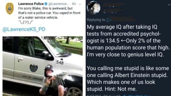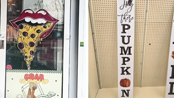
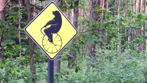
Public notices, store advertisements, and directional signs are meant to provide a quick, clear message to everyday passersby. However, when poor typography choices, hilariously literal translation fails, or confusing sentence structures get involved, the primary message often gets entirely lost in translation. Instead of guiding or informing the public, these poorly designed notices end up creating total confusion and unintentional comedy for anyone attempting to decipher them.
The humor in these visual design blunders comes from the stark gap between what the creator meant to communicate and what actually ended up printed on the poster or board. From retail promotions with broken math logic to public signs featuring wildly mismatched wording, these awkward design choices demonstrate how crucial proper proofreading really is. Taking a closer look at these baffling public displays proves that conveying a clear message requires far more care than simply printing text on paper. Here are eighteen funny signs whose confusing execution made their original point nearly impossible to comprehend.
1. That hotel doesn’t seem too inviting
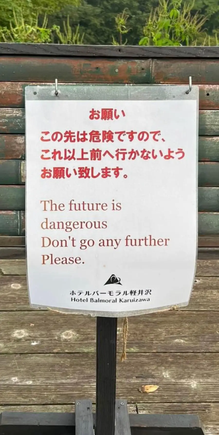
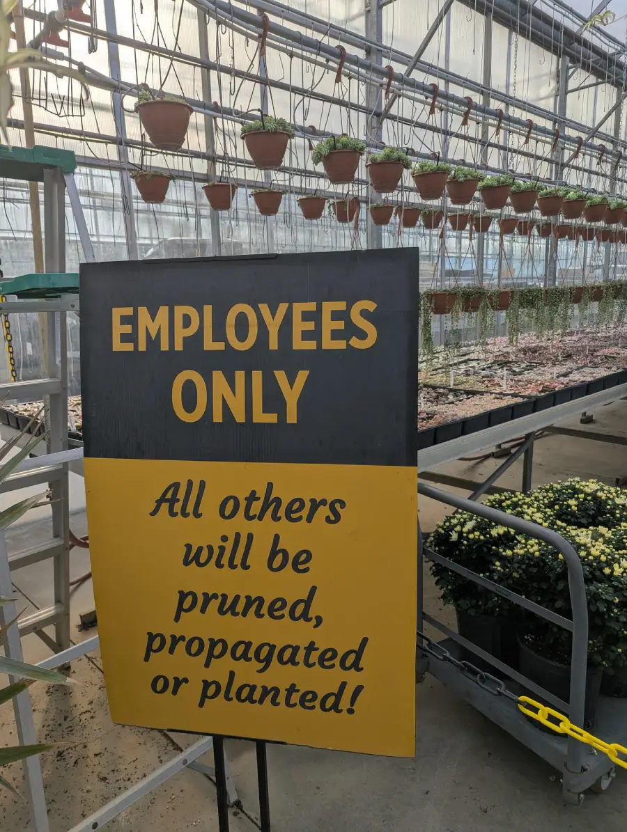
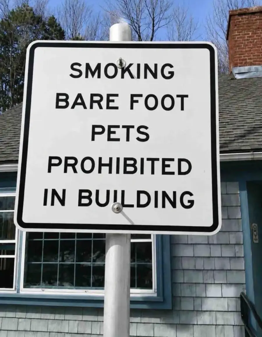
2. I don’t know which of the three Ps is more concerning
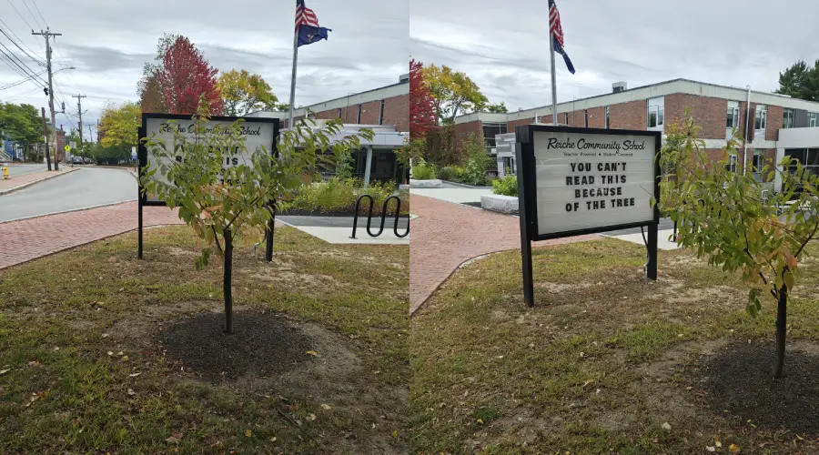
3. Are you blaming the tree?
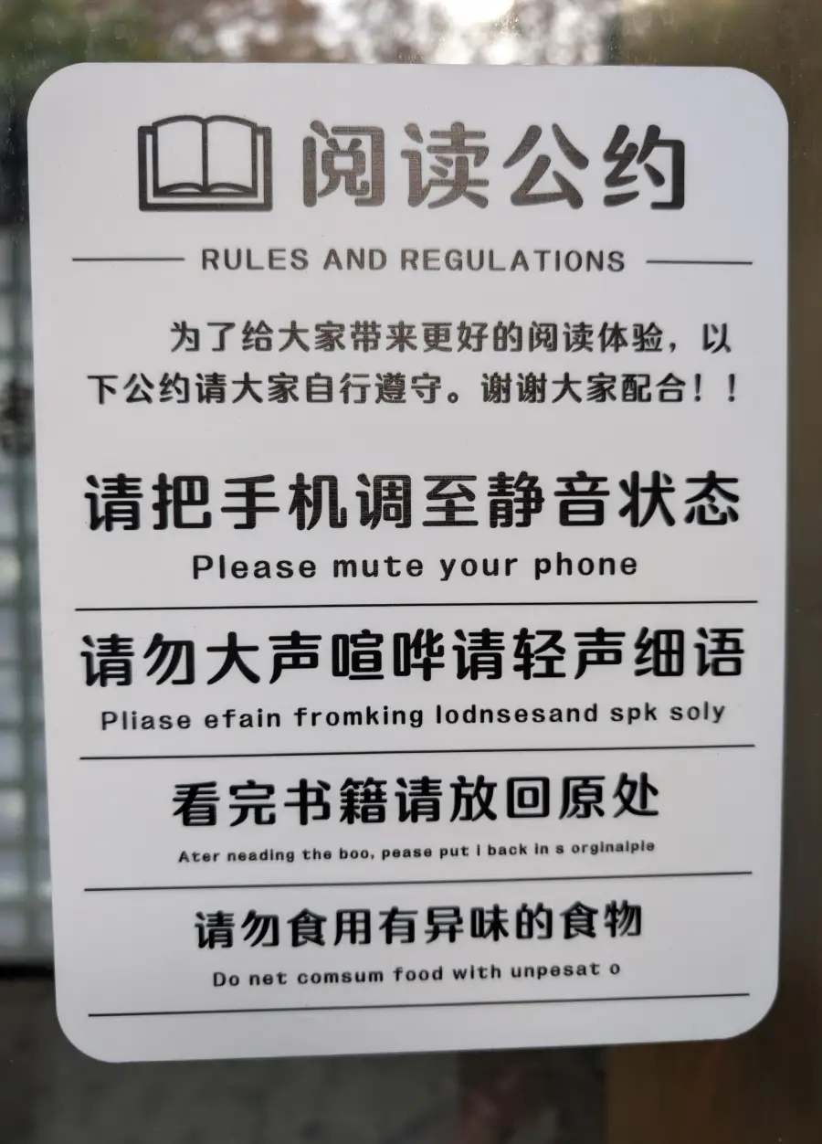
4. Top or bottom? Or front or back? Which half?

5. It started so well…
Trending on The Scroller

6. The 3-sign combo makes it hilarious
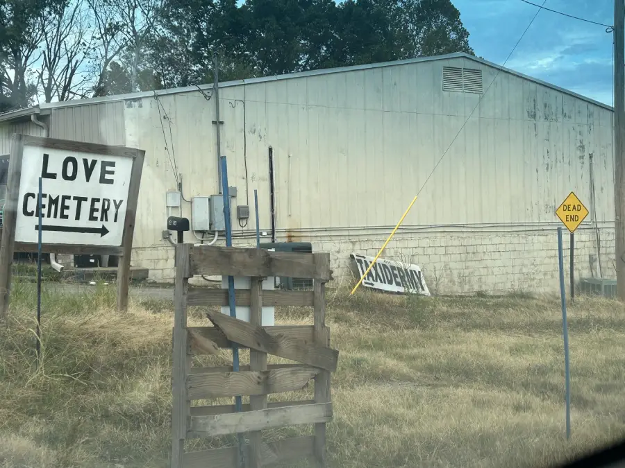
7. Gee, I wonder how he tastes with garlic

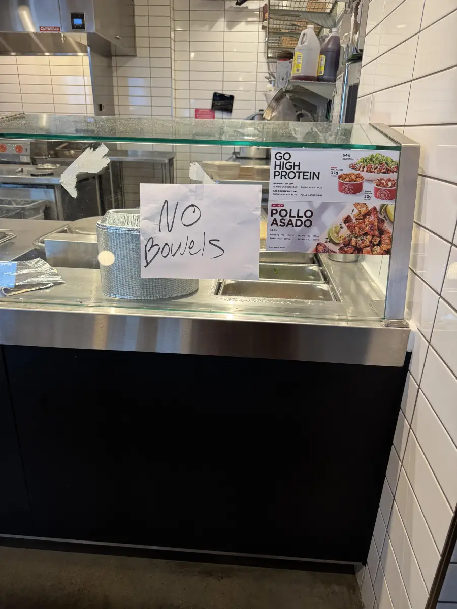
8. Oh god! I really hope they mean bowls!
Sign up for our newsletter
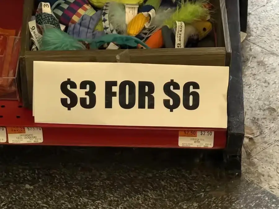
9. Haggle! You probably could get $4 for $9
10. That’s incredibly specific, but okay!
11. Somewhere around this message, there is something that makes sense to someone
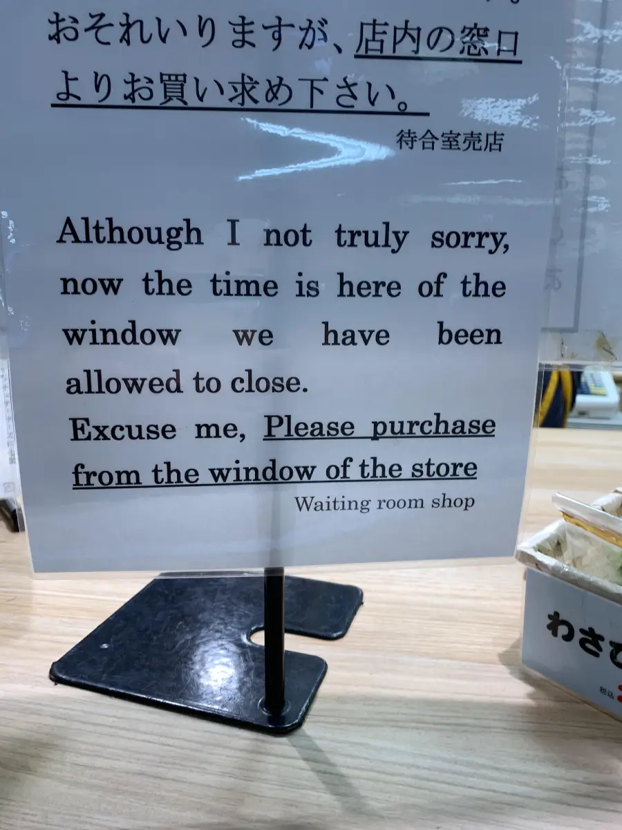
12. I think I would hang around this spot just for the chance to see this
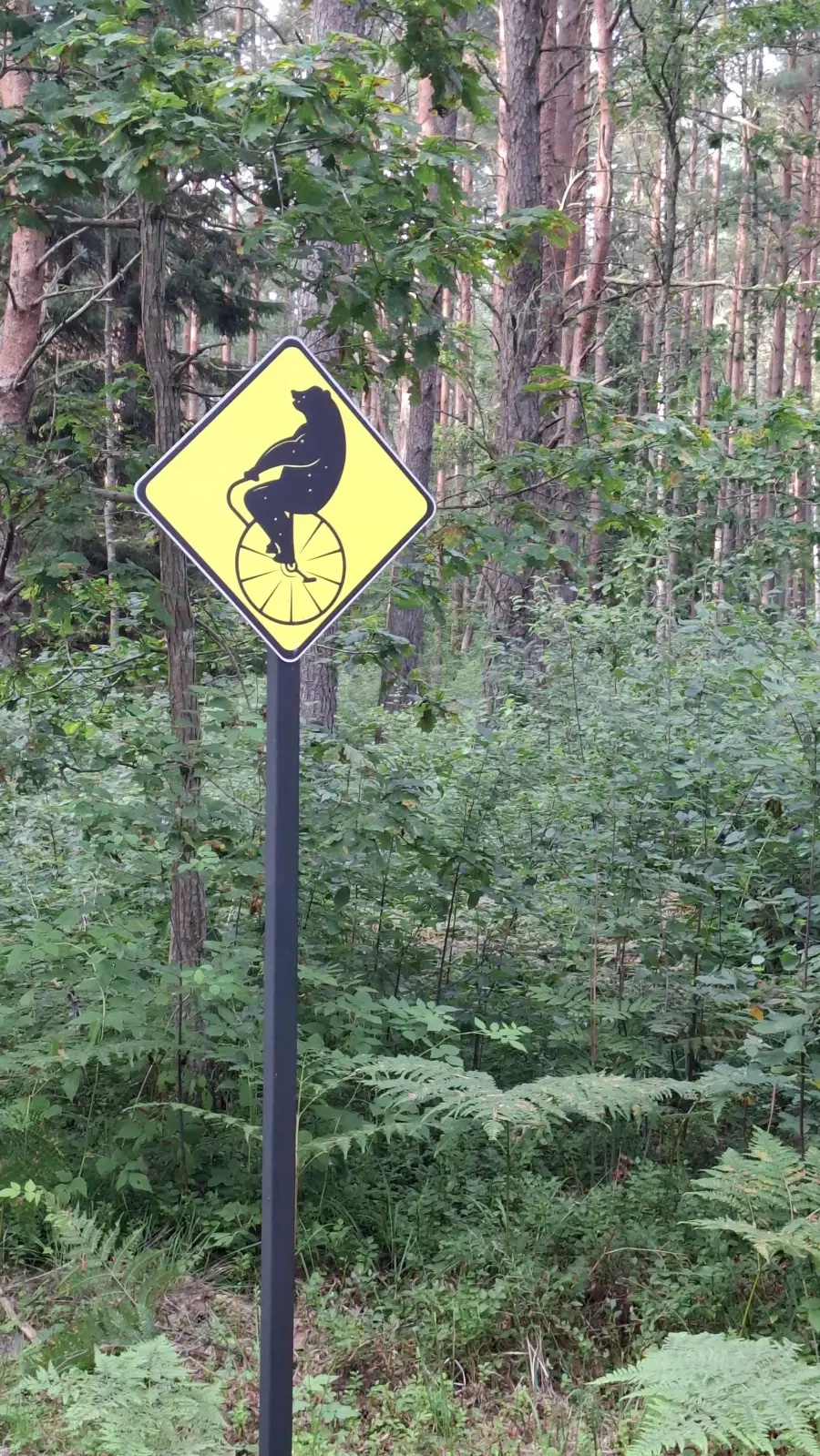
13. Even Yoda couldn’t understand!
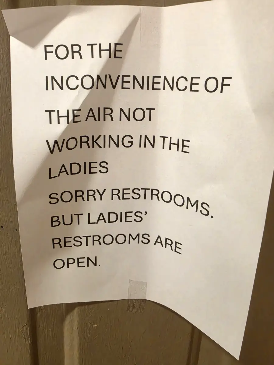
14. Doesn’t like being called trash; it’s a sensitive soul
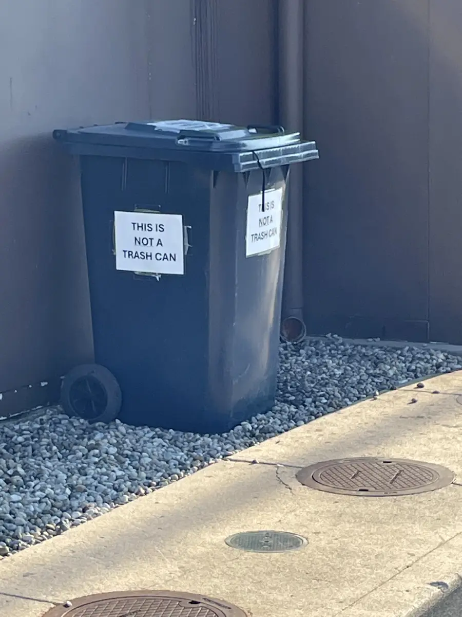
15. No, my baby does not need hosiery

16. I’m not a drinker, but I guess it’s never too late to start
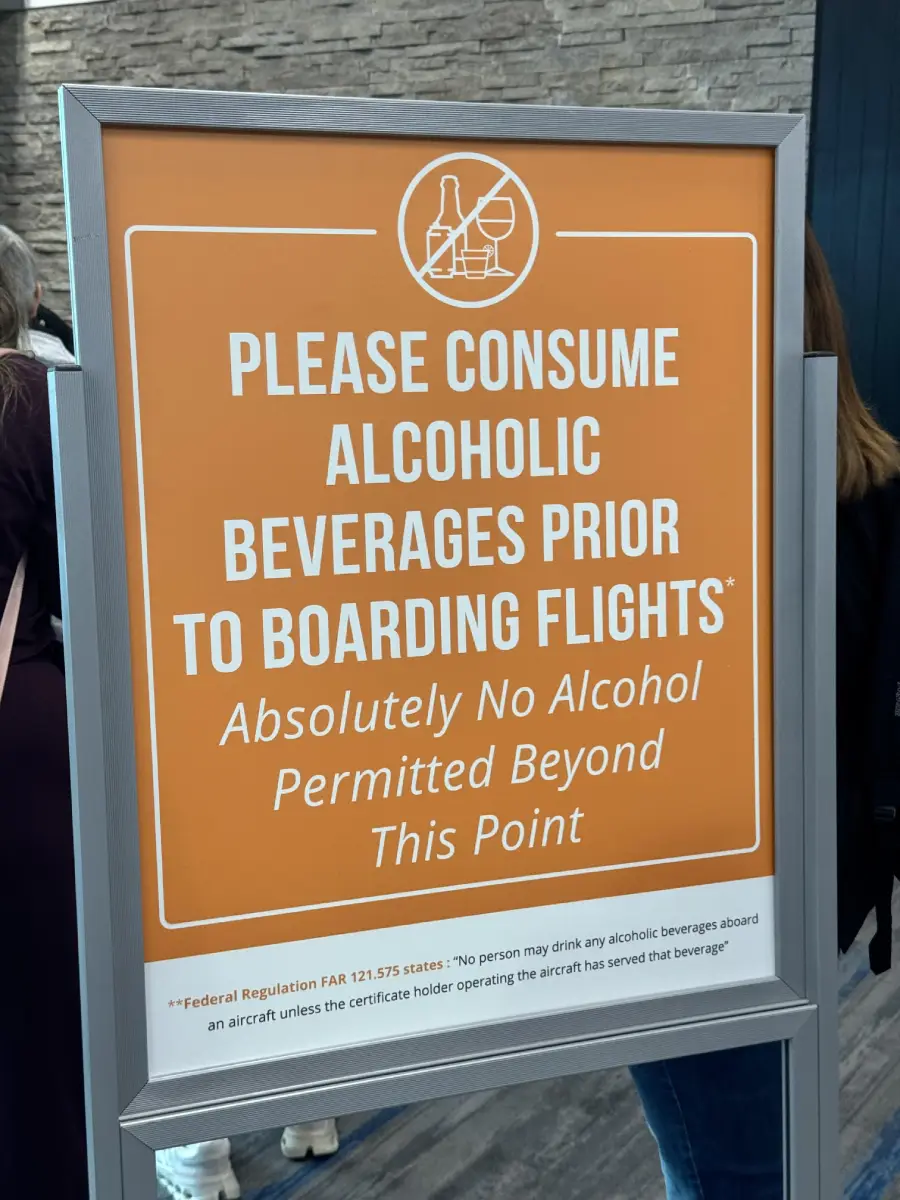
17. No bro! Not the stroe!

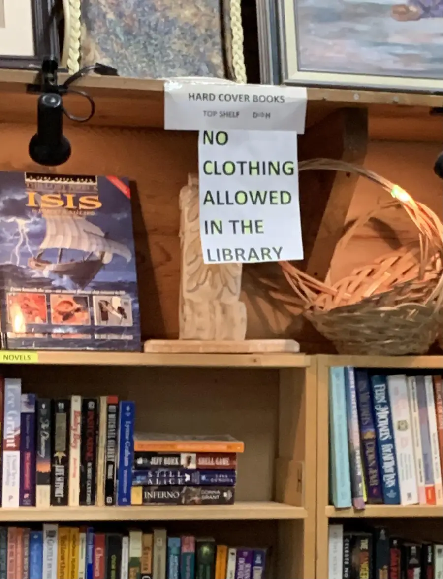
18. Is this some kind of nudist thrift store?
Have a good time with more funny signs:
Taking a look at these bizarre design mishaps and translation blunders offers a hilarious lesson in the importance of clear graphic design and thorough proofreading. The incredible mix of mathematical impossibilities, scrambled syntax, and baffling warnings proves that getting a simple point across can easily go sideways in the most unexpected ways. If you enjoy discovering funny real-world fails, viral internet humor, and entertaining sign compilations, be sure to check out these 18 Brilliant Chalkboard Signs That Nailed It, or these 21 Clever Signs That Made Passersby Laugh. If you want more, take a look at these 19 Absurd Warning Signs With Wild Origins.