Some of the world’s most iconic packaging designs have become so recognizable that they barely need a logo anymore. A particular shape, color, or container is often enough to tell you exactly what’s inside. Over time, these packages stopped being simple wrappers and became part of the products themselves, proving that great design can be just as memorable as the brands they represent.
1. Coca-Cola’s Contour Bottle
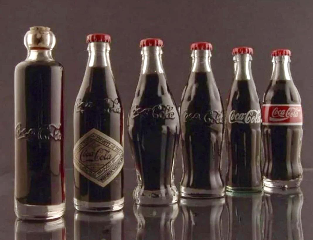
Take away the script. Peel off the label. You’d probably still recognize this bottle from across the room. Coca-Cola designed its famous contour bottle to stand out even by touch, turning a simple glass silhouette into one of the most iconic pieces of product design ever created. Few packaging designs have become this instantly recognizable.
2. Tiffany’s Blue Box
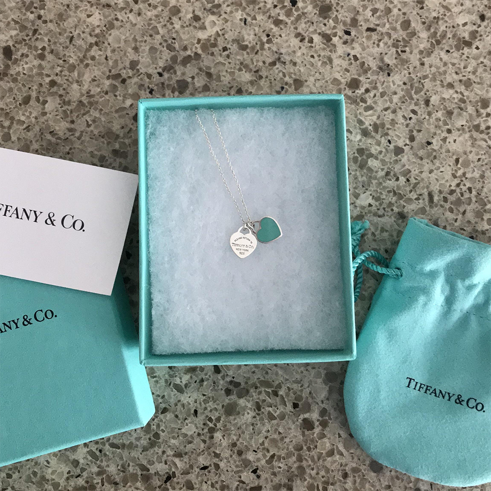
Sometimes the excitement begins long before the gift is opened. Tiffany’s little robin’s-egg blue box became so closely tied to luxury that the color alone can reveal what’s inside. How many other packages can create anticipation without showing the product at all?
3. The Pringles Tube
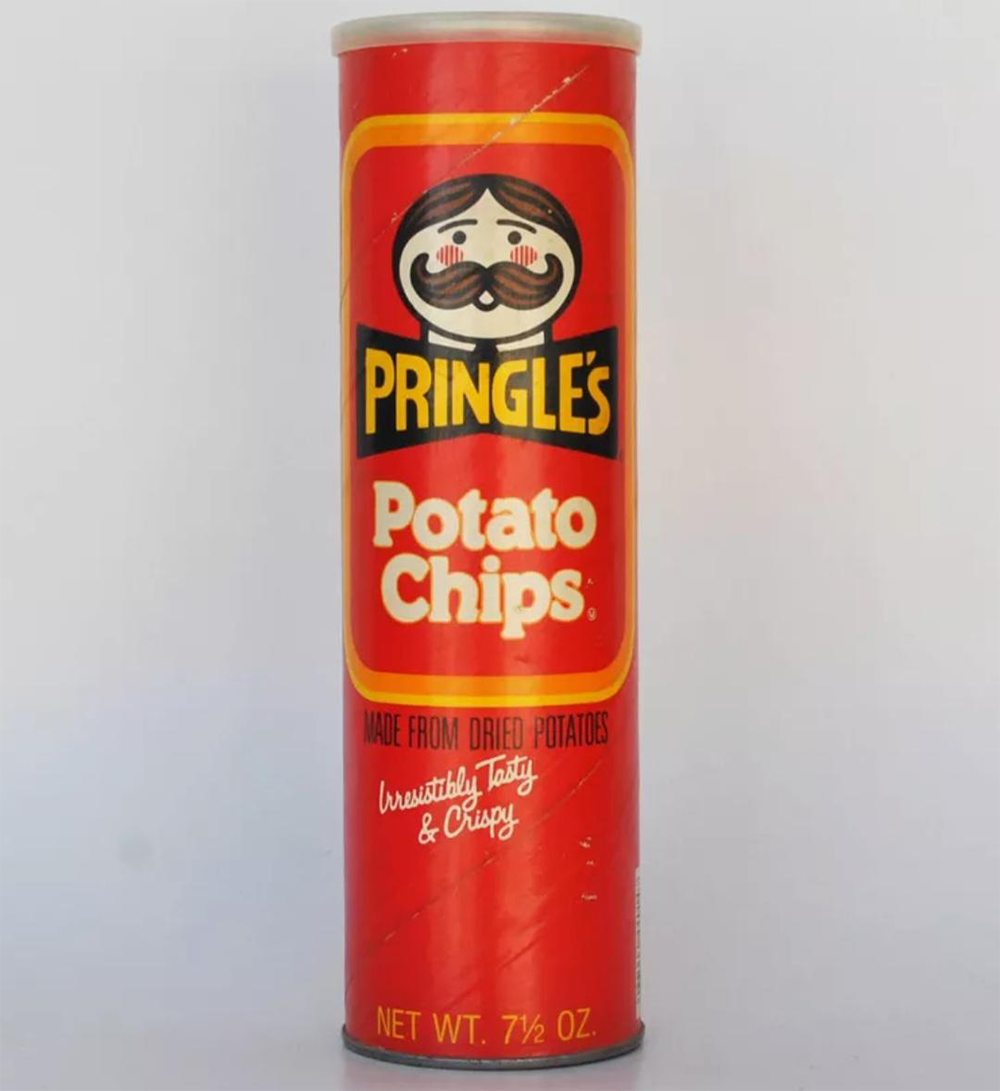
Every other potato chip company handed you a bag full of broken chips and trapped air. Pringles took a completely different approach. Its tall cardboard tube protected every crisp, stacked them neatly, and created a package so distinctive that it’s almost impossible to mistake for anything else.
4. Campbell’s Soup Can
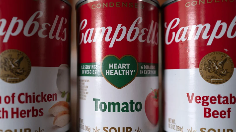
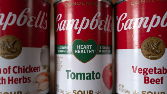
This humble soup can eventually earned a place inside museums. Long before Andy Warhol transformed it into Pop Art, shoppers already recognized Campbell’s red-and-white design from grocery store shelves across America. The packaging became just as famous as the soup it was designed to hold.
5. Toblerone’s Triangular Box

Most chocolate bars arrive in simple rectangular wrappers. Toblerone decided even the package should stand out. Its triangular box mirrors the chocolate inside while subtly echoing the shape of the Swiss Alps. Isn’t it remarkable how a simple geometric idea became impossible to confuse with any other candy bar?
Trending on The Scroller

6. Crayola’s 64-Count Box
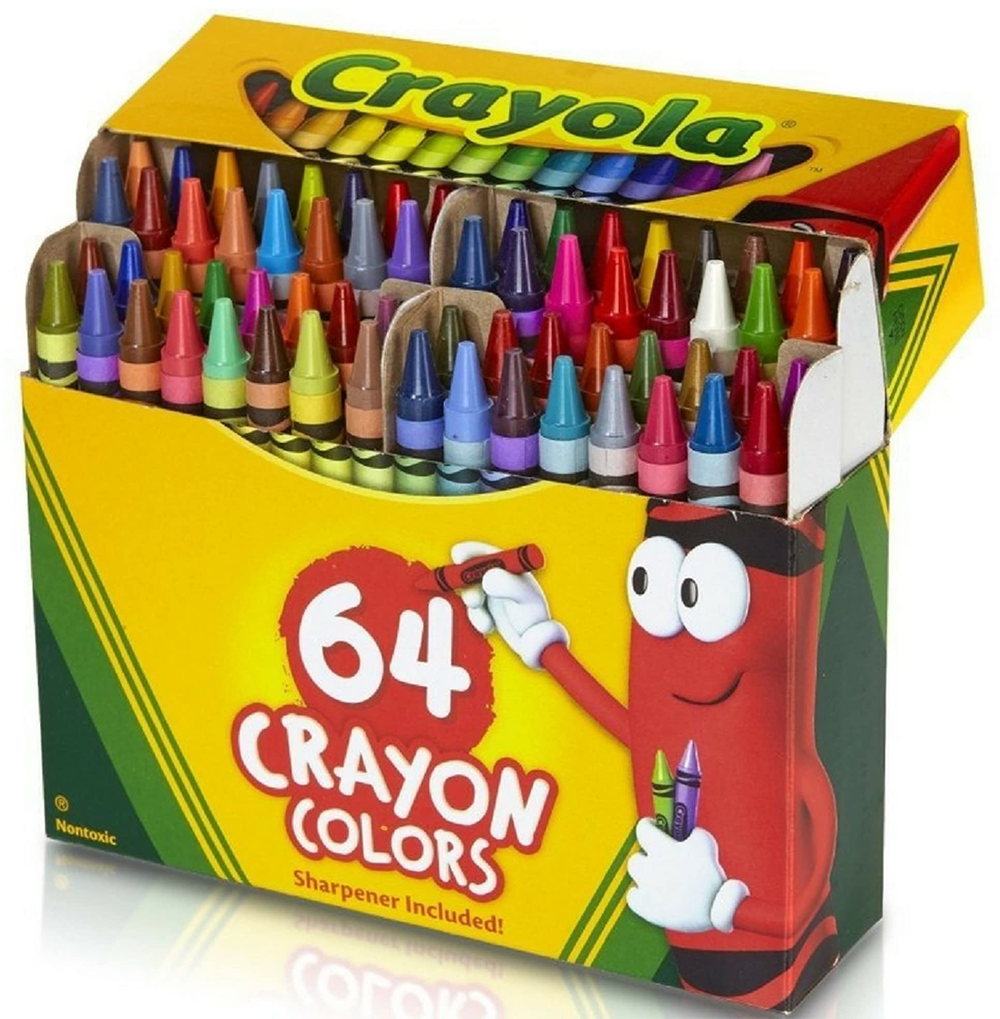
The crayons were the main attraction, but one of the best features was hiding on the back. Generations of kids remember the tiny built-in sharpener almost as clearly as the colors themselves. For many classrooms and bedrooms, opening that yellow-and-green box became part of the creative ritual.
7. Chanel No. 5 Bottle
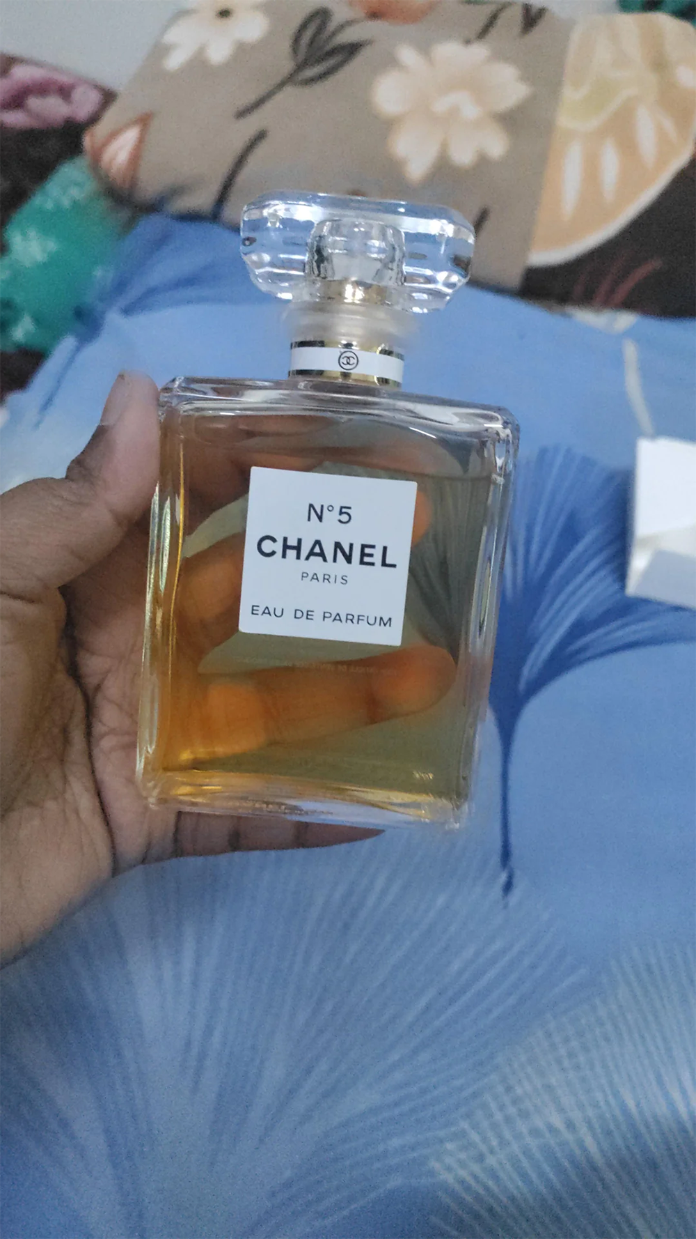
Luxury doesn’t always need elaborate decoration. Chanel No. 5 proved that with a simple rectangular glass bottle, a clean white label, and a faceted stopper that has barely changed for decades. Why redesign something when people already recognize it at a glance?
8. KFC’s Bucket
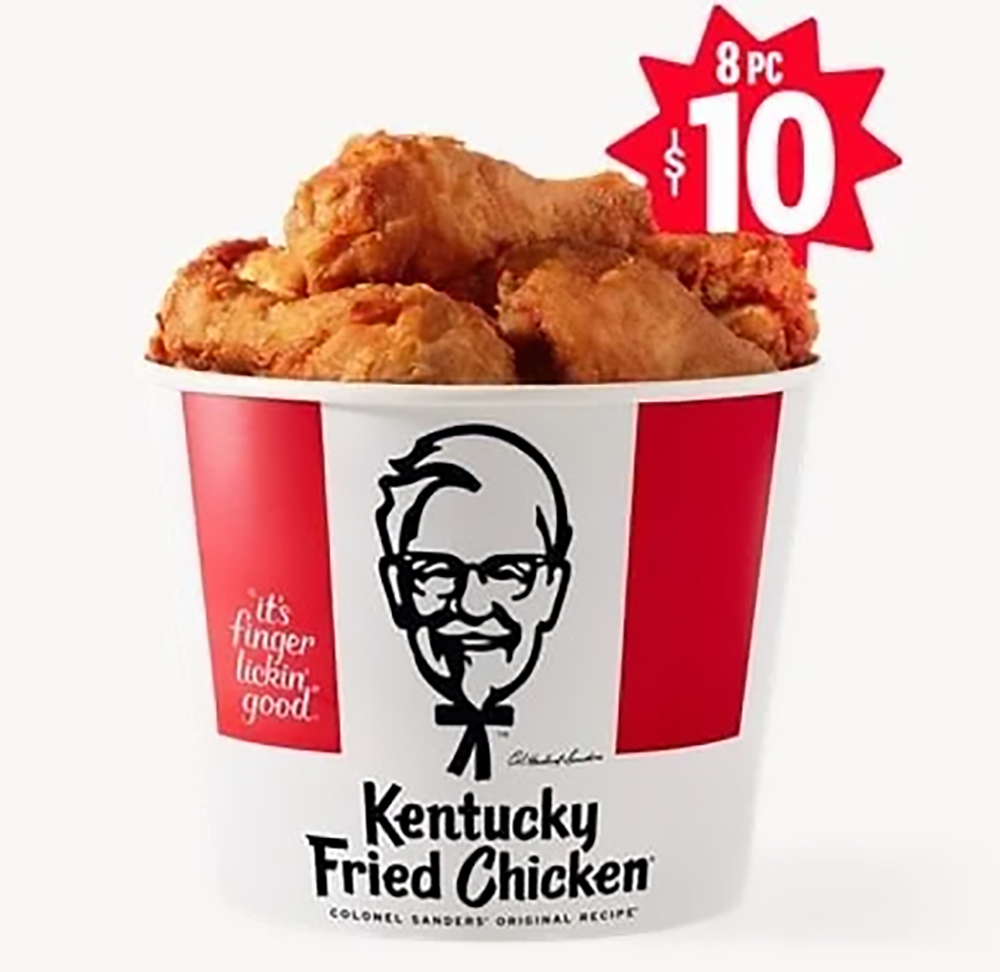
Fried chicken didn’t always come in a bucket. KFC transformed an ordinary cardboard container into one of the most recognizable packages in fast food, making family meals instantly identifiable before anyone even lifted the lid. Sometimes the container becomes just as famous as what’s inside it.
Sign up for our newsletter
9. Kikkoman’s Soy Sauce Dispenser
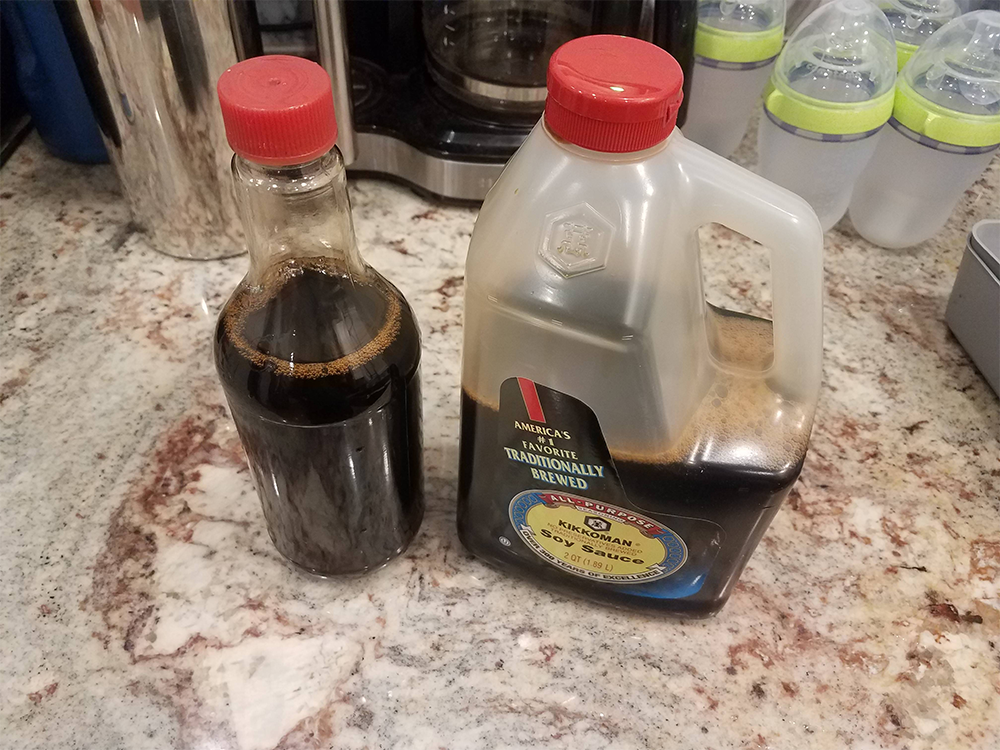
It doesn’t shout for attention, yet millions of dining tables have welcomed this little glass bottle for decades. Designed by Kenji Ekuan in 1961, the dispenser became so distinctive that its shape alone identifies the brand. That’s a rare achievement for something most people barely think about while using it.
10. Kodak’s Yellow Film Box
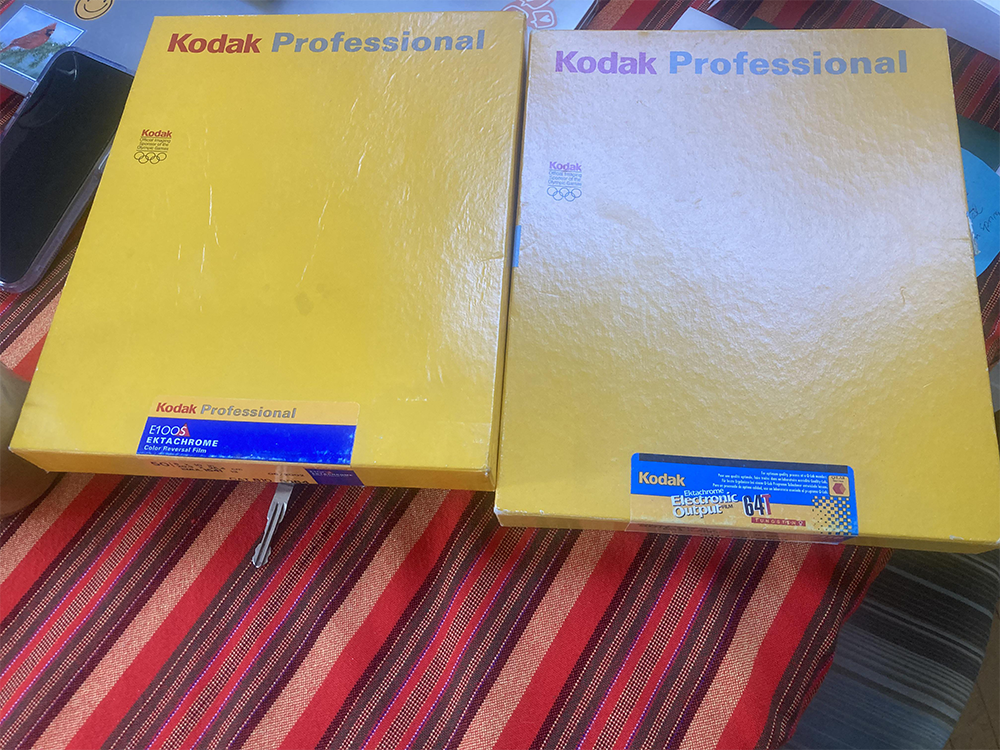
Before digital cameras, spotting this little yellow box usually meant someone’s memories were waiting to be developed. Kodak’s bold yellow-and-red packaging became so familiar that many people could recognize it before reading a single word. Who would’ve guessed a tiny cardboard box could become a symbol of photography itself?
11. Heinz Ketchup Bottle
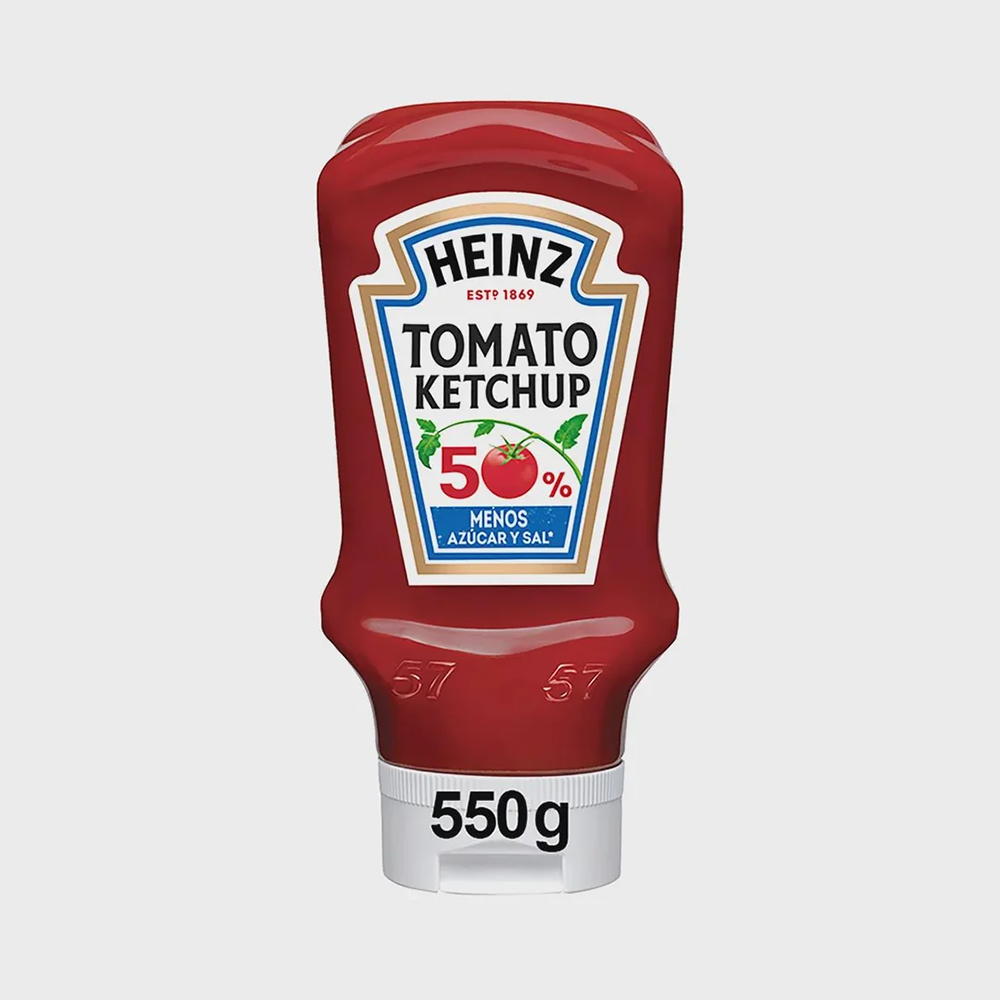
Everyone knew the routine. Turn the bottle upside down, wait a few seconds, tap the famous “57,” and hope the ketchup finally decided to cooperate. That little ritual became almost as memorable as the bottle itself, proving that sometimes the experience of using the package becomes part of its identity.
12. McDonald’s Happy Meal Box
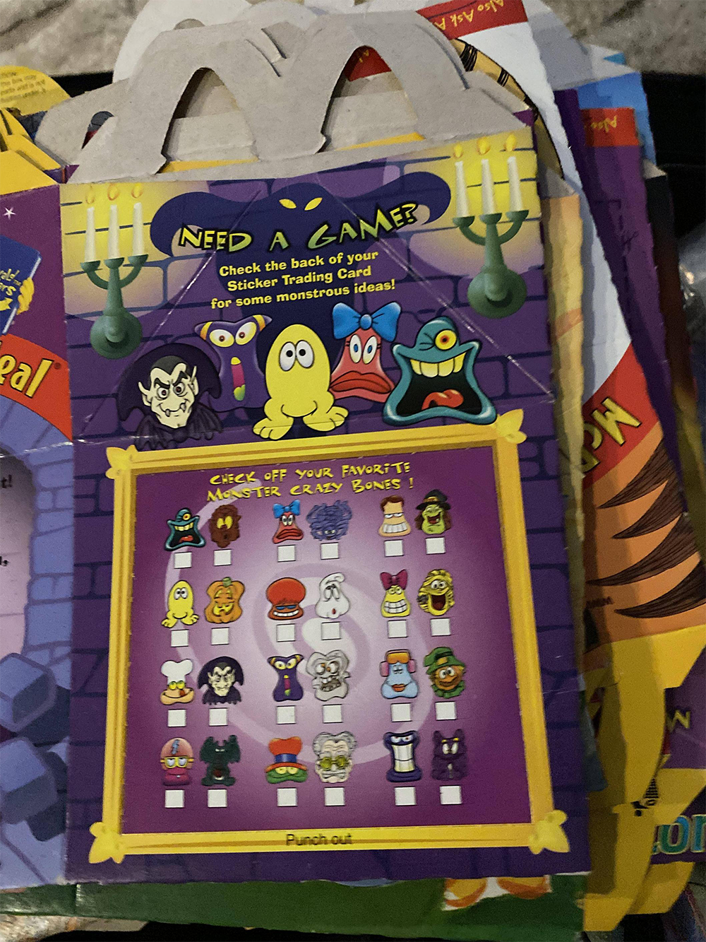
Long before kids discovered which toy was inside, they recognized the box carrying it. With its bright colors, built-in handle, and playful design, the Happy Meal turned an ordinary cardboard container into one of childhood’s most recognizable sights. After all, who needed to read the logo when the box already gave it away?
13. Morton Salt Canister
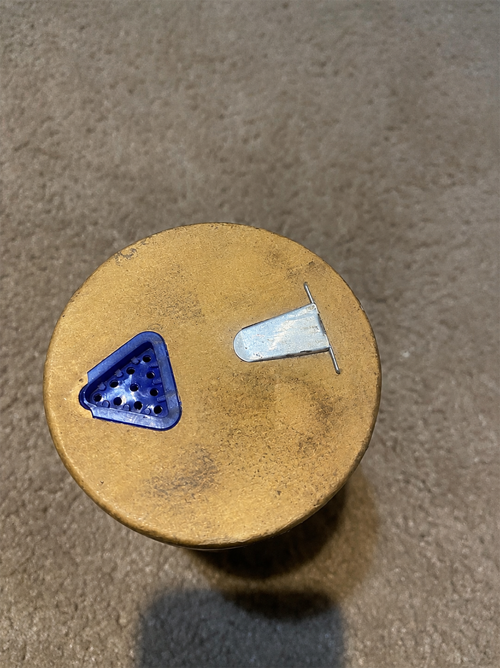
Some packaging changes every few years. This one somehow kept evolving without ever feeling different. The dark blue canister, bright yellow accents, and iconic Umbrella Girl have remained familiar to generations of shoppers, quietly proving that consistency can be one of the strongest design choices a brand ever makes.
14. Absolut Vodka Bottle
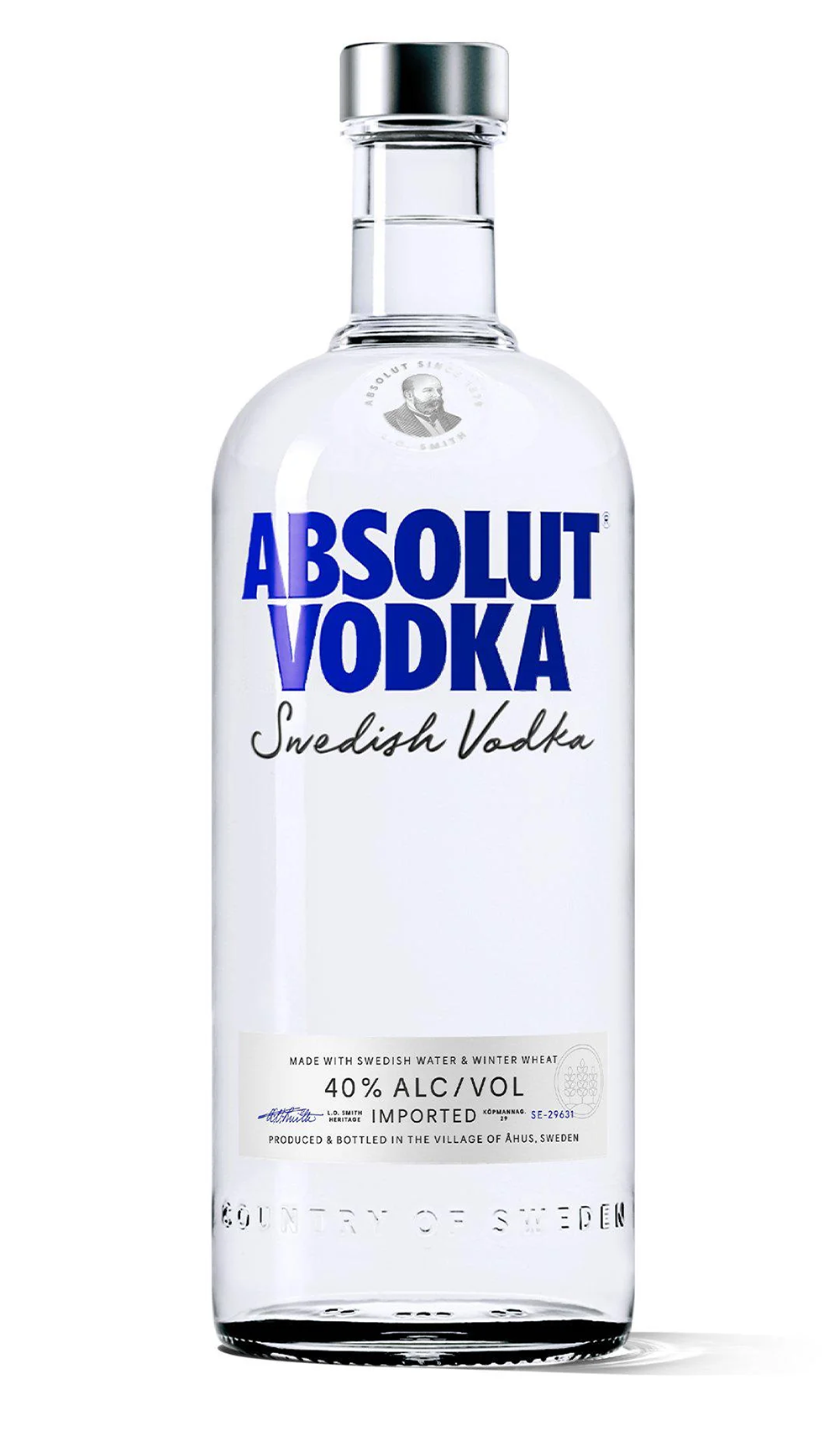
It looks more like an old medicine bottle than a premium liquor bottle. Ironically, that’s exactly what helped make it unforgettable. Absolut’s simple silhouette became the centerpiece of one of advertising’s most successful campaigns, where the bottle itself could be recognized before a single word appeared beside it.
15. Altoids Tin
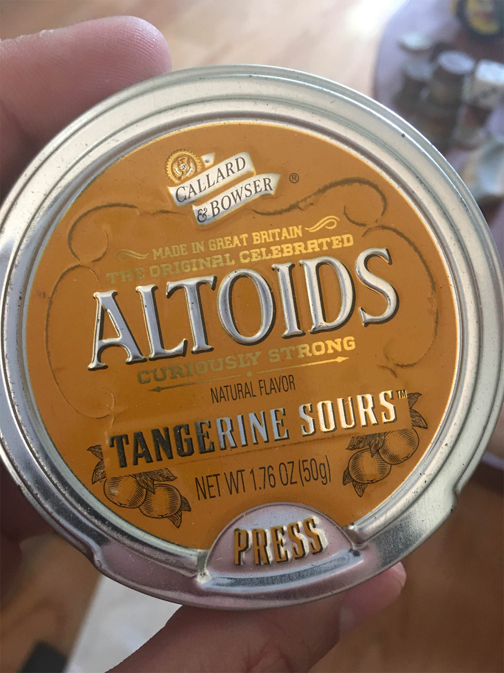
The mints were gone. The little metal box stayed. People filled Altoids tins with coins, sewing supplies, batteries, guitar picks, and dozens of other small treasures long after finishing the candy. How many packages become so useful that customers refuse to throw them away?
16. Nutella Jar
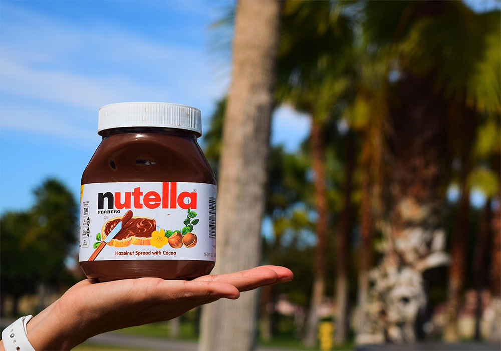
Breakfast looked incomplete without it sitting on the table. The wide jar, white lid, and familiar white label became such an everyday sight that many kitchens seemed to have one permanently waiting in the cupboard. Sometimes the most recognizable packages aren’t flashy at all. They’re simply the ones you grow up seeing every morning.
17. Jack Daniel’s Square Bottle
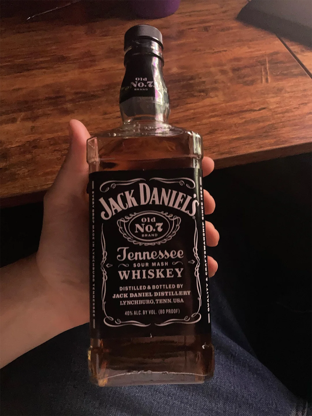
Round bottles dominate the whiskey aisle, which makes this one impossible to ignore. Jack Daniel’s embraced sharp corners instead of smooth curves, creating a silhouette that stands apart even from a distance. It’s a simple design decision, but one that helped turn an ordinary bottle into a lasting brand signature.
18. Marmite Jar
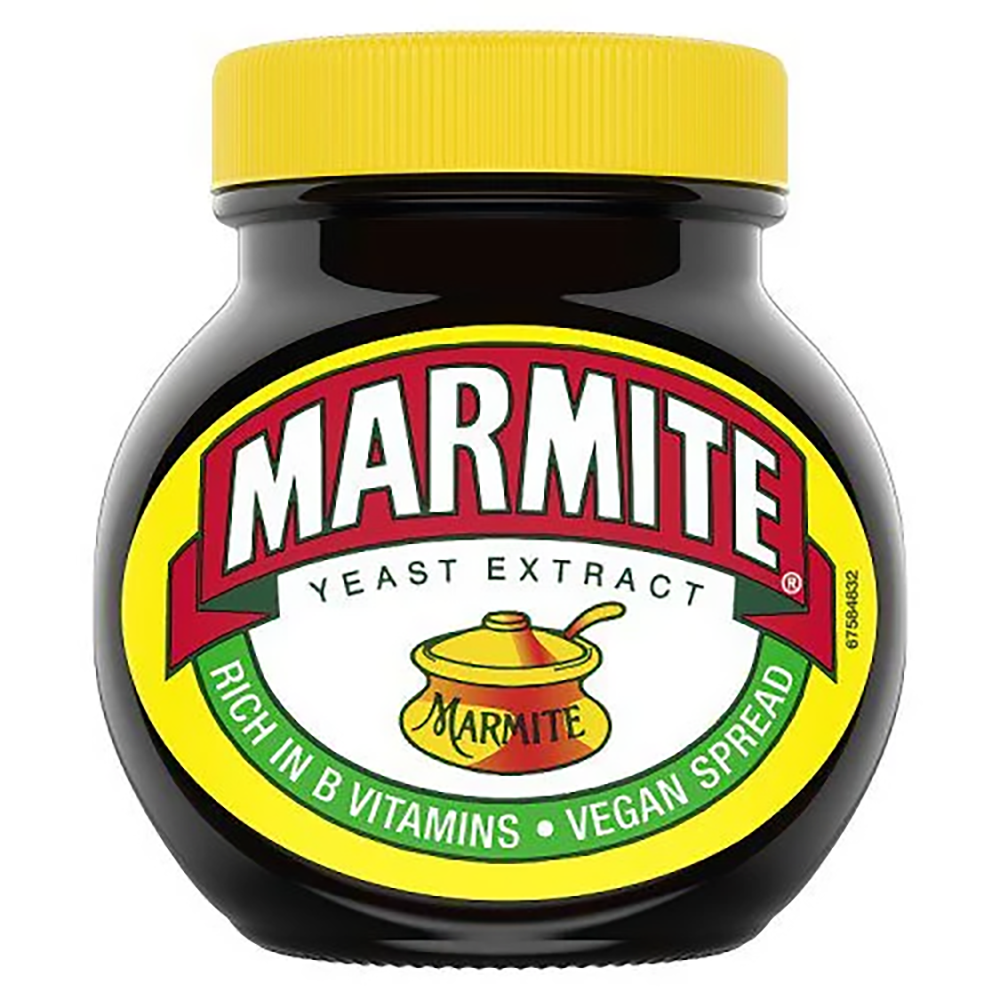
Love it or hate it, chances are you’d recognize the jar before reading the label. Its dark glass, bright yellow lid, and familiar color scheme have remained remarkably consistent for decades. Isn’t that one of the biggest compliments a package can receive, when people instantly know what’s inside without checking the name?
19. Quaker Oats Cylinder
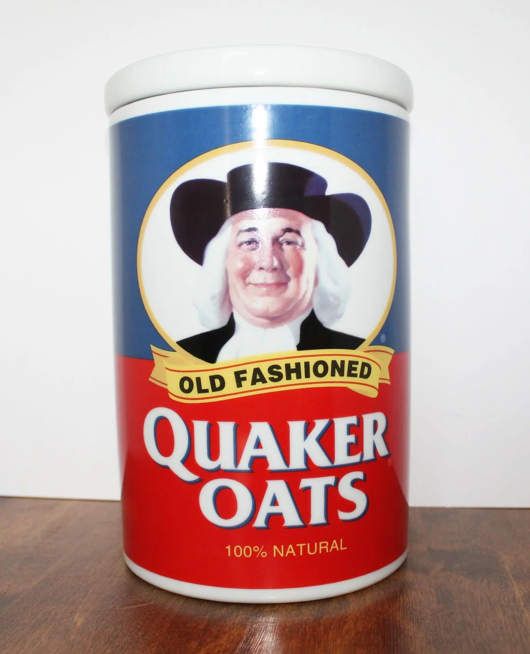
Imagine walking down a cereal aisle filled with rectangular boxes. Then you spot a tall cardboard cylinder instead. That unusual shape immediately separated Quaker Oats from nearly everything around it, proving that standing out sometimes has less to do with graphics than with choosing an entirely different form.
20. Apple’s iPhone Box
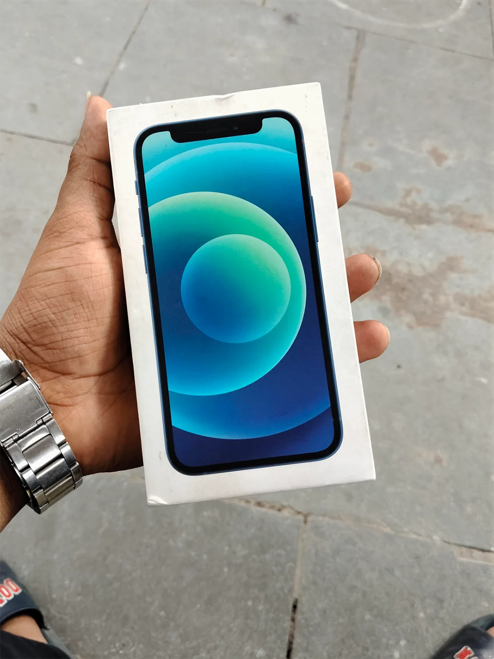
Unlike many of the classics on this list, this package doesn’t rely on bold colors or unusual shapes. Instead, Apple’s clean white box, minimal text, and carefully staged presentation transformed opening a phone into an event of its own. It’s a reminder that iconic packaging designs didn’t disappear in the modern era. They simply became quieter.
The best packaging designs do something remarkable: they stop feeling like packaging altogether. Whether through shape, color, texture, or even the way they’re opened, these containers became inseparable from the products they hold. In many cases, people recognize the package first and only think about the brand second.
Keep Exploring The Scroller
If you enjoy discovering the stories behind everyday objects, keep exploring The Scroller for more fascinating looks at unforgettable brands, clever product designs, nostalgic classics, and the surprising details hiding in plain sight:
21 Packaging Fails That Accidentally Turned Into Jokes