
design
-
18 Design Ideas That Worked Better in Theory
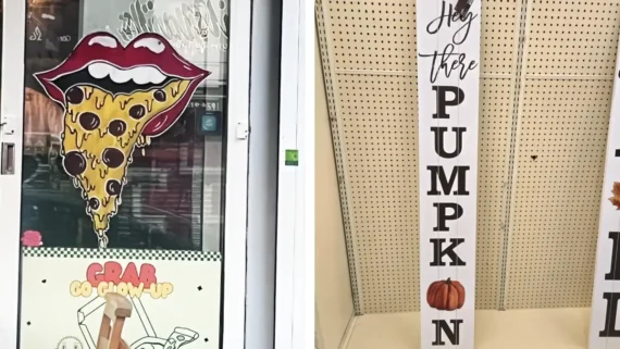
Laugh along with 18 design ideas that worked better in theory, featuring hilarious typography fails, awkward graphics, and confusing packaging.
-

18 Objects That Became Design Icons Without Trying
These design icons started as pens, kitchen tools, toys, and everyday objects before their unmistakable designs became cultural classics.
-
20 Packaging Designs Everyone Instantly Recognizes
From Coca-Cola’s contour bottle to Pringles tubes and Toblerone triangles, these 20 packaging designs became icons of their own.
-
20 Ugly Cars from the 1970s
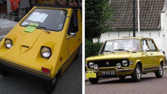
Explore 20 ugly cars from the 1970s, featuring unusual styling, questionable design choices, and unforgettable automotive experiments.
-
19 Design Fails That People Spotted in Everyday Places
Ready for a total reality check on public engineering? Discover 19 hilarious design fails that ordinary people spotted out in the wild.
-
19 Product Designs That Passed Quality Control and Should Not Have
Discover 19 baffling product designs that somehow passed corporate quality control when they shouldn’t have.




-
20 Times the “Professional” Designer Clearly Had One Job and Failed Miserably
Check out 20 fails where a professional designer missed the mark. From unreadable fonts to terrible color choices, these errors are pure chaos.
-
30 design fails that went very wrong
These design fails are on an unfortunate level of their own, from baffling signs to painfully bad layouts. 30 photos you won’t believe were approved.
-

30 Design fails that are on an unfortunate level of their own
Design fails sometimes do not make life easier, smoother, and at the very least less confusing. But every once in a while, a creation slips through the cracks that makes…
-

25 Storefront Displays That Deserve a Marketing Award
A good storefront is supposed to get your attention, but some go way past that. These displays turn the sidewalk into free advertising with handmade signs, dramatic props, and setups…
-
20 Design Fails That Prove Common Sense Isn’t That Common
Check out 20 hilarious design fails that prove common sense isn’t that common — from confusing layouts to epic product mishaps.
-
25 Off-Brands That Missed The Mark
Explore 25 off-brands that missed the mark — quirky, funny, and sometimes disastrous knock-offs that didn’t quite live up to the originals.
-
20 Photos That Embody 1980s Design
These 20 photos that embody 1980s design showcase the bold colors, quirky patterns, and retro flair that defined one of the most iconic design decades.
-

29 Bad Designs That Were Doomed Ideas From The Start
We’re not exactly sure how some of the world’s more ill-conceived designs end up actually crossing the bridge between conceptualization and ultimate manifestation, but they sure do. The worst, though,…
-
25 Weird Fashion Designs That Make Us Roll Our Eyes In Frustration
These bizarre fashion designs pushed high fashion to extremes, from inflatable runway looks to outfits that defied logic.
-

17 Things So Horribly Designed That We Can’t Help But Laugh
In a world where innovation often steals the spotlight, let’s take a moment to heed the wise words of Charles Eames: “Innovate as a last resort. More horrors are done…
-

7 History-Defining Product Fails To Never Forget
It’s all well and good to take an outside of the box approach to the world of product design. However, there are certain product designs that just will never make…