designer-fails

We’ve all been there: you’re staring at a project for so long that your brain just starts filling in the gaps for you. But when you’re a professional designer, those blind spots can turn into legendary disasters once the “Print” button is hit. There’s a certain kind of magic in seeing a high-budget billboard or a brand-new product hit the shelves, only for everyone to realize within five seconds that the font makes a harmless phrase almost impossible to decipher. It’s the ultimate “you had one job” moment, and honestly, we can’t stop looking at them.

From logos that vanish due to a lack of contrast to signs that make no sense, these fails are a masterclass in why a second opinion is mandatory. You’d think that after several rounds of edits, someone would have noticed that the text is unreadable or that the colors clash in the worst way possible, but here we are. Grab your coffee and get ready to facepalm, because these twenty creative slip-ups prove that even the pros can totally lose their way.

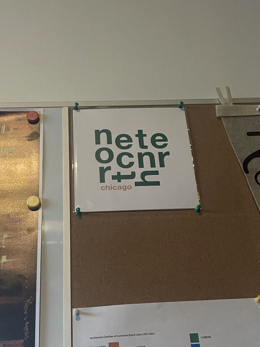
1. Is that supposed to say “north center”?

A square sign pinned to a corkboard displays the text "netecnrr+ chicago" in green and red, arranged in a modern, stacked layout with stylized letters.
CRAPPYDESIGN / VIA REDDIT.COM

2. I do love me some bulldoc

A spiral notebook cover with the text "LIFE IS BETTER WITH BULLDOG" in gold and white letters, decorated with pink and white paw prints, and featuring a photo of a fluffy, happy puppy.
CRAPPYDESIGN / VIA REDDIT.COM

3. If only Louisiana looked like a letter of the alphabet

A hand holds a mug featuring the word "LOVE," with the "O" replaced by an outline of Louisiana state, against a tiled background.
CRAPPYDESIGN / VIA REDDIT.COM

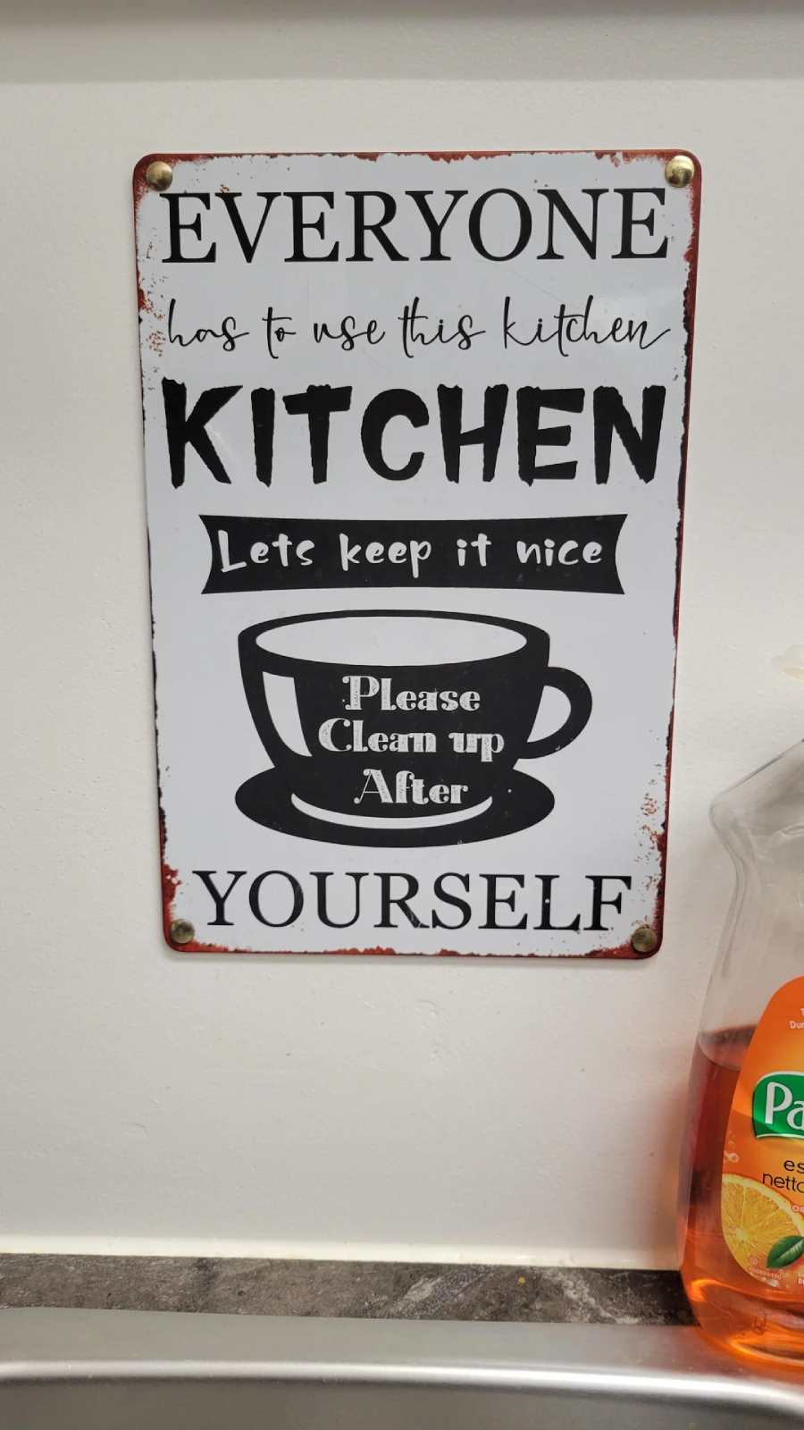
4. Someone saw this and still decided to hang it on their kitchen kitchen

A sign on a white wall reads: "Everyone has to use this kitchen. Kitchen. Lets keep it nice. Please clean up after yourself." A bottle of Palmolive dish soap is visible on the right.
CRAPPYDESIGN / VIA REDDIT.COM

5. Are you enjoying your time at the bchea house?

Wooden block letters arranged to spell "BEACH" in different colors and sizes, placed on a wooden surface with part of a decorative background visible behind.
CRAPPYDESIGN / VIA REDDIT.COM

6. The orbit of the erath moon

A faded, yellow playground sign reads "THE ORBIT OF EARTH MOON SUN" with a simple graphic of orbits and the sun. The word "EARTH" is misspelled as "ERATH" and there is graffiti on the sign.
CRAPPYDESIGN / VIA REDDIT.COM

7. Oh, yes, Kuala Lumpur’s info is very interesting

A magazine page features an article titled "The Unique Allure of a Nanyang Crossroads Kuala Lumpur," with a photo of a tall modern building, palm trees, and a mural of a person's face on a wall in the foreground.
CRAPPYDESIGN / VIA REDDIT.COM

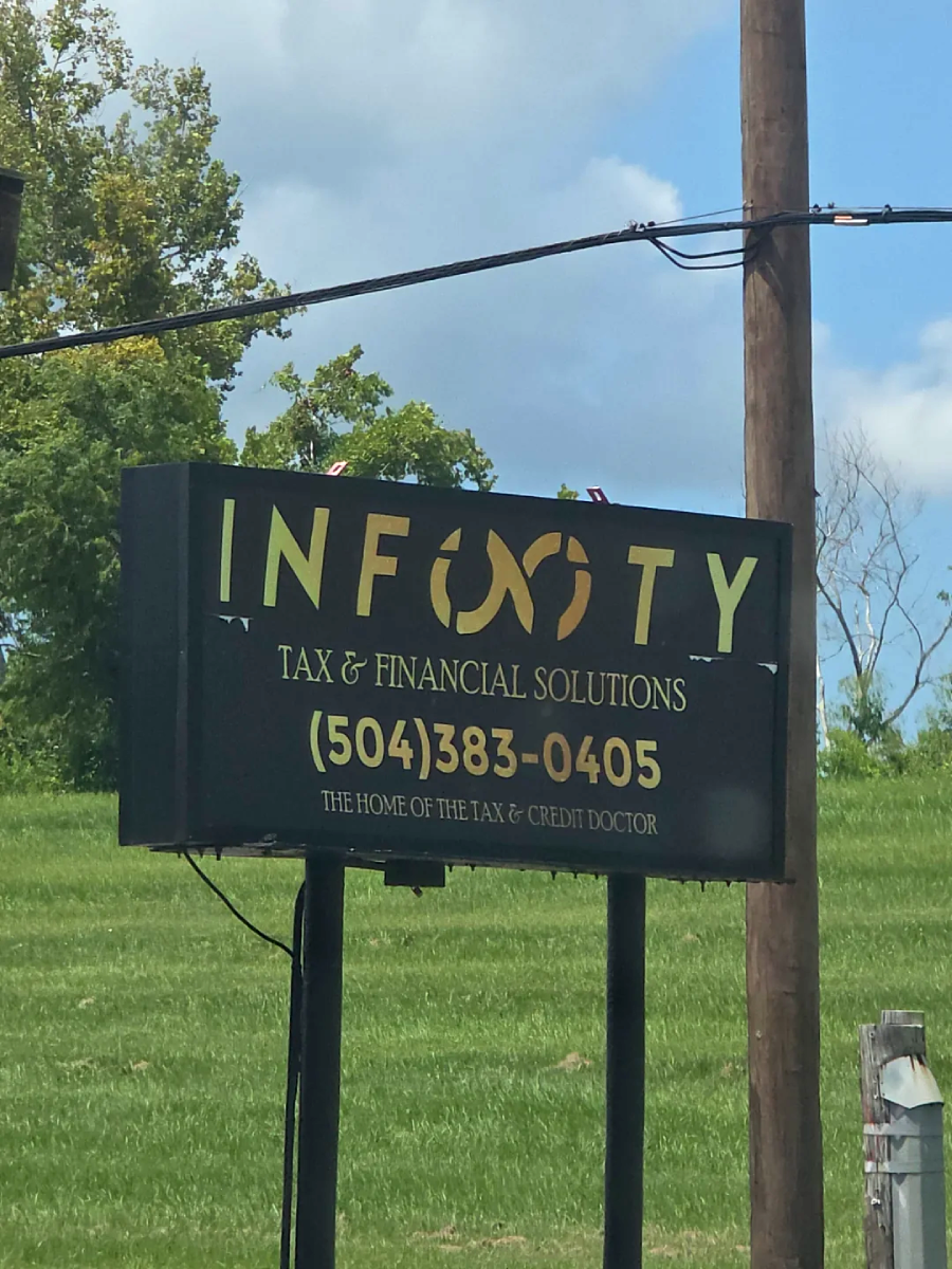
8. Sorry, but it reads “infooty” to me

A roadside sign reads "INFINITY TAX & FINANCIAL SOLUTIONS" with a stylized infinity symbol. Below is the phone number (504) 383-0405 and the tagline "The Home of the Tax & Credit Doctor." Grass and trees are in the background.
CRAPPYDESIGN / VIA REDDIT.COM

9. Maybe what you should connect are those letters

Cover of "The Recovery Workbook II: Connectedness" featuring layered, overlapping letters spelling "Connectedness" on a patterned brown background. Authors and Boston University details are listed at the top right.
CRAPPYDESIGN / VIA REDDIT.COM

10. Is it the 1st or 3rd step?

Instruction diagram showing three steps labeled 1st, 2st, and 3nd for installing or removing parts inside a machine door, with arrows and a wrench symbol indicating the process.
ONEJOB/ VIA REDDIT.COM

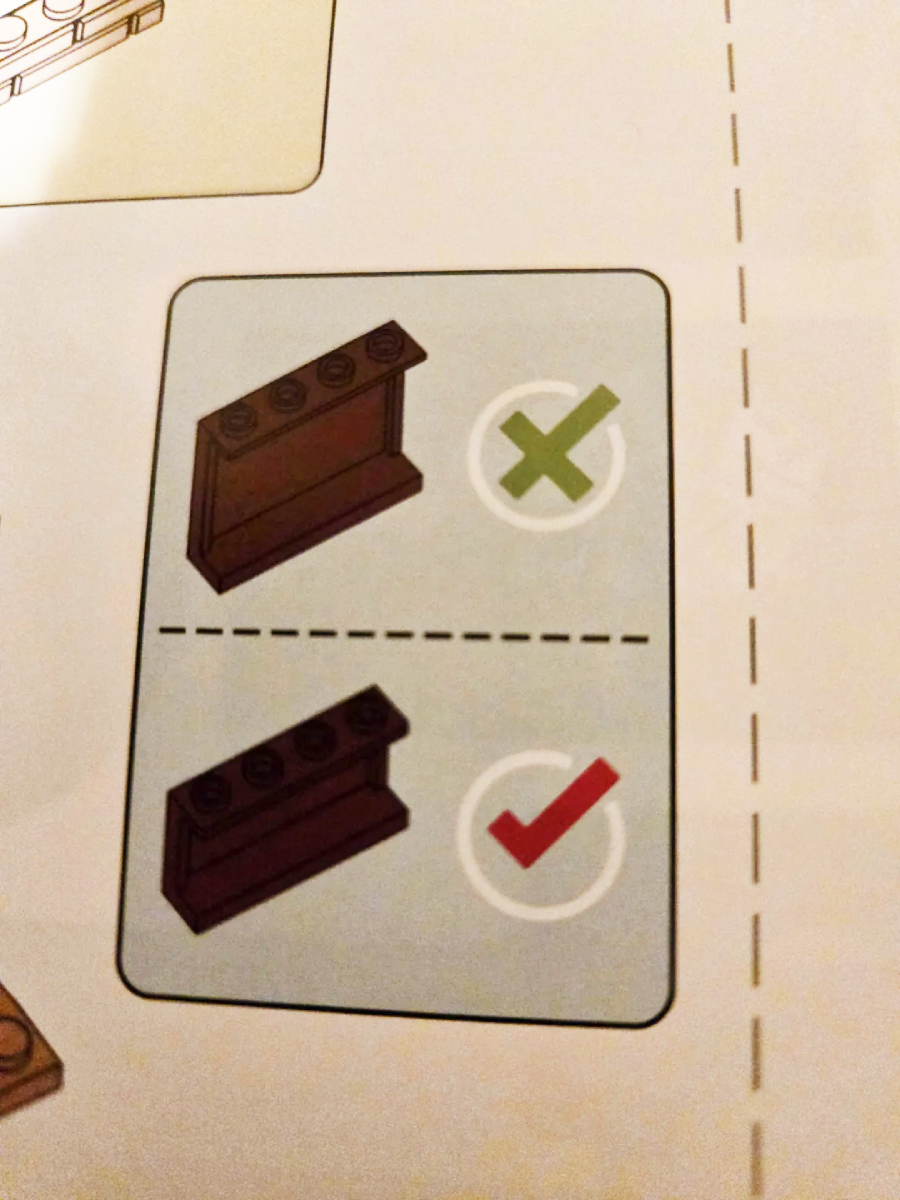
11. Which one is the correct one?

Lego instruction page showing a sloped brown brick with studs on the top incorrectly used (with a green X), and the correct usage with studs facing forward (with a red checkmark).
ONEJOB/ VIA REDDIT.COM

12. Do you hate me?

A hand holds a brown gift bag decorated with three gold and black balloons, gold stars, and the text "May happiness never return!" in cursive and bold fonts.
ONEJOB/ VIA REDDIT.COM

13. Which holiday is that?

A blue and white Valentine’s Day card on a dark wood table reads “Happy Valentine’s Day!” with blank spaces labeled “To:” and “From:” and small blue heart graphics at the bottom.
ONEJOB/ VIA REDDIT.COM

14. Someone didn’t want this to be read

A close-up of a pink cylindrical bottle with white text describing directions and features of a hair care product, partially obscured by glare and difficult to read. A hand is holding the bottle on the left side.
ONEJOB/ VIA REDDIT.COM

15. Up and up again, I guess

A close-up of an elevator panel with two buttons, both labeled "UP" in black—with one label upside down. Both buttons have Braille beneath the text and a small red light indicator.
ONEJOB/ VIA REDDIT.COM

16. A piece of advice: Don’t follow these instructions

Instruction sheet for a Hallstatt self-adhesive bathroom stand, showing six illustrated installation steps: wipe wall, mount product, tear off film, align and paste, squeeze out air, and tighten the nut.
ONEJOB/ VIA REDDIT.COM

17. The designer saw the logo and decided to ignore it

A close-up of a hand holding a pen with the text "PLEASE USE UPLOADED LOGO www.____.com" printed on it, indicating a printing error. A box of similar pens is blurred in the background.
ONEJOB/ VIA REDDIT.COM

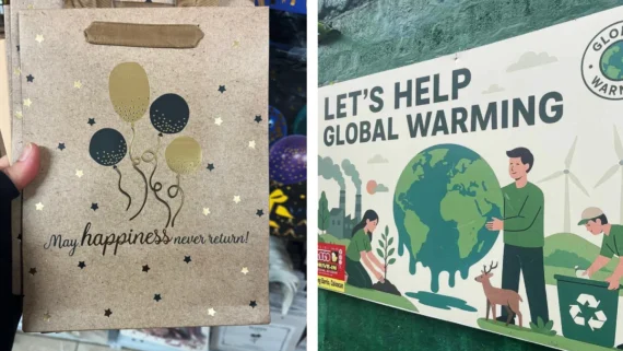
18. Sure, cause global warming needs all the help it can get

A mural shows people caring for the Earth: one plants a tree, another holds the planet, and a third recycles. A deer, wind turbines, and factories are in the background. Text reads "Let’s help global warming" and "Global warming.
ONEJOB/ VIA REDDIT.COM

19. Easter, you say? Hmmm

A colorful folder features Sanrio characters including Pompompurin holding a pumpkin, My Melody with a cupcake, and Hello Kitty with a pumpkin, all against a purple striped background with "Easter" text and Halloween decorations.
CRAPPYDESIGN / VIA REDDIT.COM

20. The A needs M

A restroom door sign shows two stylized human figures with missing letters in the words "WOMAN" and "MAN." Text below reads: "The WOM needs AN, The AN needs M." An arrow points to a sliding door handle.
CRAPPYDESIGN / VIA REDDIT.COM

Want more funny fails?

It’s a hilarious and humbling reminder that even the most expensive branding packages are susceptible to human error. These epic fails by the professional designer community prove that no matter how much you pay for an ad, you should always, always get a second opinion before you go to print. If you’re ready to dive into more funny fails, don’t miss these 20 Construction Fails That Made Homeowners Regret It, or 20 Plumbing Disasters That Started as “Easy DIY Fixes”. You can also enjoy these Tattoo Disasters: 20 Hilarious Typos That Are Permanent Now.

Meet the Writer