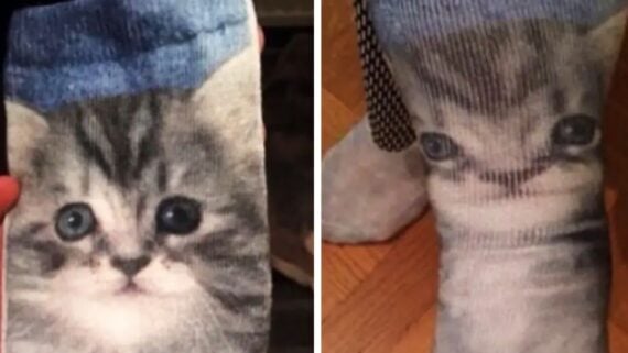
A pair of socks featuring a realistic kitten print that becomes distorted when stretched over the foot.
via Canva

Some designs miss the mark by a little, but these miss by a mile and then even some more. They ran a dang lap around the track of failure itself. You know the feeling: you reach for a handle that isn’t a handle, climb stairs that end in a wall, or read a label that argues with itself. Design fails don’t just look odd; they waste time, break trust, and make you wonder who signed off.

1. Want to go grab a brugre?

A colorful cartoon mascot with big eyes, holding up a peace sign and a soccer ball, stands next to the words “Bangbun Beer” and “Big Dream” on a red sign, set against a dark evening sky.
ASPEHEAT / VIA REDDIT.COM

2. They were going for the “cascade” effect

A vintage bathroom with blue tiled walls, a bathtub with a handheld shower, a white sink, a mirror above the sink, a toilet, and patterned floor tiles. Various toiletries are on the sink and bathtub edge.
CHAOSE50 / VIA REDDIT.COM

3. How many steps do you count here?

A terrazzo floor with a black and white speckled pattern. Two potted plants sit in the upper right corner, while a shadow and a partial view of a black shoe appear at the bottom.
G87A_L / VIA REDDIT.COM

4. If only there were a better place to put the tower…

The word "PARIS" is spelled out with decorated letters; the letter "I" is replaced by an illustration of the Eiffel Tower. The letters feature various black and white Paris-themed designs.
DELETED / VIA REDDIT.COM

5. Is that the easiest acronym you could come up with?

A banner reading "E.D.I.M.G.I.A.F.A.D. Every Day In Middle Georgia Is Armed Forces Appreciation Day" with a bald eagle, an American flag, and star symbols, hanging inside a building.
DELETED / VIA REDDIT.COM

6. But, what about the people in wheelchairs?

A parking space with a black and yellow speed bump blocking access to the curb ramp, making it difficult for wheelchairs or strollers to use the ramp. Two vehicles are parked nearby.
OFFICIALDAMPSQUID / VIA REDDIT.COM

7. I’m ready to welcome the 20107!

Novelty glasses shaped like the number 2017 are displayed on a store shelf. The glasses have large, round openings for eyes inside the zeros. Brightly colored party supplies and packaging are visible in the background.
DELETED / VIA REDDIT.COM

8. When you’re your worst publicity

A sign in a window reads "Window Signs made here," but the text is reversed, as seen from outside a brick building.
BOOT_AND_CATS / VIA REDDIT.COM

9. All ye shall come in for the healing of burgers

A brochure with large black text reading "HEALTHY BURGERS" in a stacked format, with the Grill’d Healthy Burgers logo in red on the right side, placed on a table with papers underneath.
DEADPOOLYES / VIA REDDIT.COM

10. Hate to say this, but design isn’t your strongest suit

A brick building has a sign with jumbled letters above the windows reading "NDEEISG IHGBNOCREHNOTOEDR." A door on the right has a sign for "neighborhood DESIGNcenter." Cars are parked in front.
ROSCOEG / VIA REDDIT.COM

11. If only I had a pair of scissors…

A hand holds scissors in packaging. The package instructions say to use scissors to cut the cable tie securing the scissors, illustrating the paradox with a diagram.
BEARDEDMAN32 / VIA REDDIT.COM

12. They look more like they’re disconnecting… from life

A simple illustration of a woman and a man standing side by side, joined by a musical note above their heads. The text below reads, "Music connecting people.
DELETED / VIA REDDIT.COM

13. You should’ve gone with a better designer

A billboard shows a smiling woman with her face comically misaligned, as if her eyes and mouth are out of place. The text reads: "Our £25 glasses don’t look like £25 glasses. Should’ve gone to Specsavers.
GALLOWBOB / VIA REDDIT.COM

14. Love, Morriage, Boby

Three panels display Scrabble tiles and a ring spelling out "LOVE," "MARRIAGE," and "BABY" with corresponding dates: February 10, 2014; July 26, 2015; and September 5, 2017. Text narrates "First comes... Then comes... Then comes a...
REDSOX1524 / VIA REDDIT.COM

15. Kitten got Gremlin very quickly

A pair of socks featuring a cute kitten’s face. On the left, the sock is unworn, clearly showing the kitten’s face. On the right, the sock is worn, stretching and distorting the kitten’s features on a foot.
DELETED / VIA REDDIT.COM

Want more funny content?

If you liked these design fails, keep the momentum and check When Typography Goes Wrong: 25 Unforgettable Fails, or these Car Upgrades That Made Things Worse. You can also enjoy these Unusual DIY Fixes That Actually Worked.

Meet the Writer

Matt has spent over the last 8 years as both a writer and editor, working in Seattle and Brooklyn, where he is now based. He loves escaping the tirelessly fast pace of the “Mad Apple” that is NYC by taking walks and runs through parks where he’s able to catch up on the latest tea about society from the city’s ever chatty, always hungry, occasionally maniacal, pigeons. They always have a lot to say. When he’s not taking his urban nature strolls, or dutifully combing the deepest rabbit holes of the internet to find the content that’s worth sinking your mind’s teeth into, he’s likely holed up at a dark-lit dive bar with a new book and/or some friends, or just as easily he could be on the hunt for the next addition to his steadily growing plant family.

These days Matt’s caught up in trying to provide folks as many vivid glimpses into the days long since passed as he can, through fun and engaging collections of hand-picked vintage photos.