Usually, great typography disappears, but bad typography shouts. One off-kilter letter, a reckless line break, or a kerning that squeezes words together, and the whole message changes. You don’t need to be a designer to feel it because your brain trips before you even finish reading.
These photos capture that moment in the wild: menus with mystery spacing, signs that hyphenate the wrong syllable, and posters where a font stretch does all the wrong heavy lifting. It’s comedy, but also a part cautionary tale reminding you that letters matter more than you think.
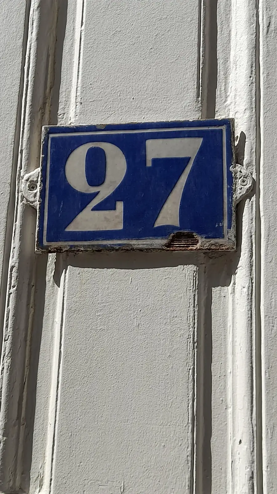
1. What number do you live in? 27 or 97?
2. Don’t you dare die safely

3. Do what to the community?

4. Not sure what I’m supposed to do

5. That typography is wonfderul

Trending on The Scroller
6. This looks like it came out of the brain of an anxious person

7. I don’t think you know how to design

8. You are not our trollies

Sign up for our newsletter
9. It should come with instructions to read it

10. The left window is a bit radical

11. But it says turn right!

12. Would you know what accident to do?

13. Don’t ever forget: hood up

14. But I wanna see pets cooking bicycles

15. The van got a little creepy

16. They ran out of capital Ps

17. Nobody wants to disturb your child eating experience

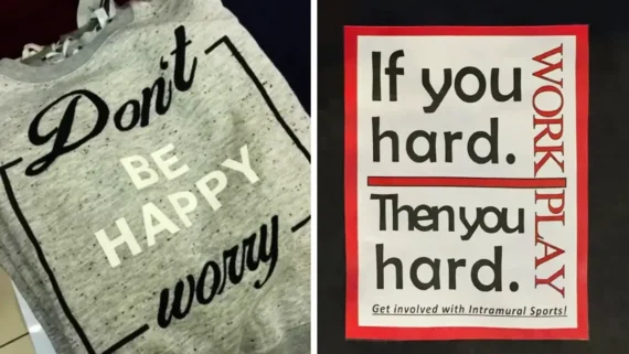
18. That’s a slow-motion play time

19. You’re gonna need two hands Grandma

20. Why would you want to end them?

21. If you hard, then you hard

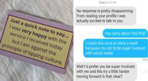
22. Be afraid to give

23. If you don’t want it to be pushed, don’t put it there

24. It’s tarts, right?

25. In case of an emergency, smoke first

Explore more funny content:
If you’re in the mood for more delightful design chaos, keep scrolling through these 20 Design Fails That Prove Common Sense Isn’t That Common, or these 20 Bizarre Designs That Went Completely Off the Rails. You can also check these 20 Photoshop Fails That Make Zero Sense.