Logos are everywhere, but how often do we really look at them? What seems like a simple design is often packed with subtle details, clever symbolism, and hidden meanings that most people never notice. Behind the clean lines and bold colors, many of the world’s most iconic logos hold secrets that reflect a brand’s story, values, or creative flair.
Some logos are full of surprises once you know where to look. You’ve probably seen these logos hundreds of times without catching what’s hidden in plain sight. But once you see it, you can’t unsee it. Let’s dive into 20 hidden messages in logos.
1. FedEx
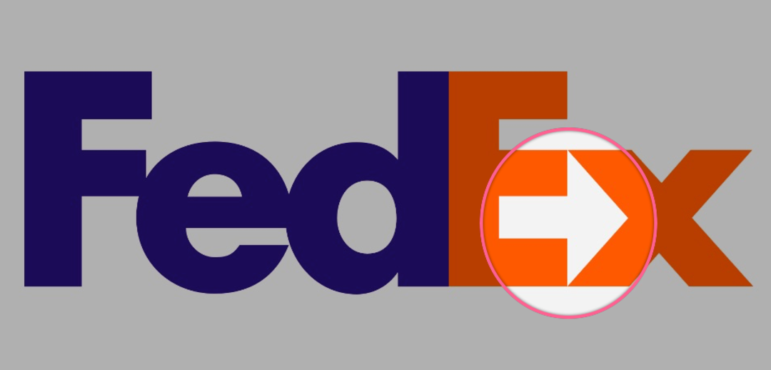
At first, it just looks like a clean, bold logo. But if you look closely between the E and the x, there’s a hidden arrow. It’s a subtle nod to the company’s speed and direction.
2. Amazon

That little arrow under the word Amazon isn’t just a smile. It points from A to Z, which is their way of saying they sell basically everything. Once you know, it’s pretty obvious.
3. Baskin-Robbins
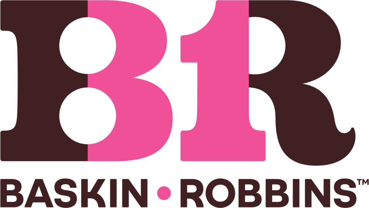
If you look at the BR in the logo, the pink parts actually make out the number 31. That’s a nod to their original idea of having 31 different flavors of ice cream.
4. Toyota

At first, it looks like a random set of overlapping shapes, but every letter of the word Toyota can actually be found inside the logo. It’s one of those things you can’t unsee once you know.
5. Hershey’s Kisses
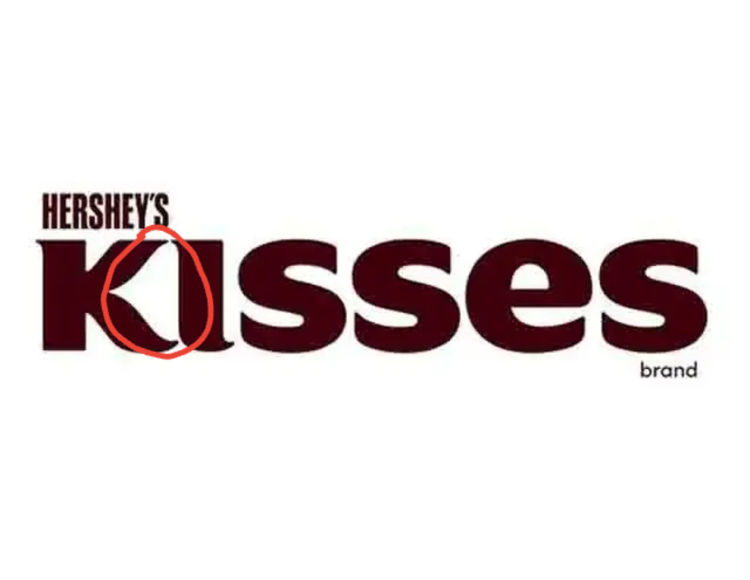
This one is easy to miss, but if you look between the K and the I in the word Kisses, there’s a little Hershey’s Kiss shape hidden in the negative space. It’s a cool little Easter egg.
Trending on The Scroller

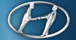
6. Hyundai
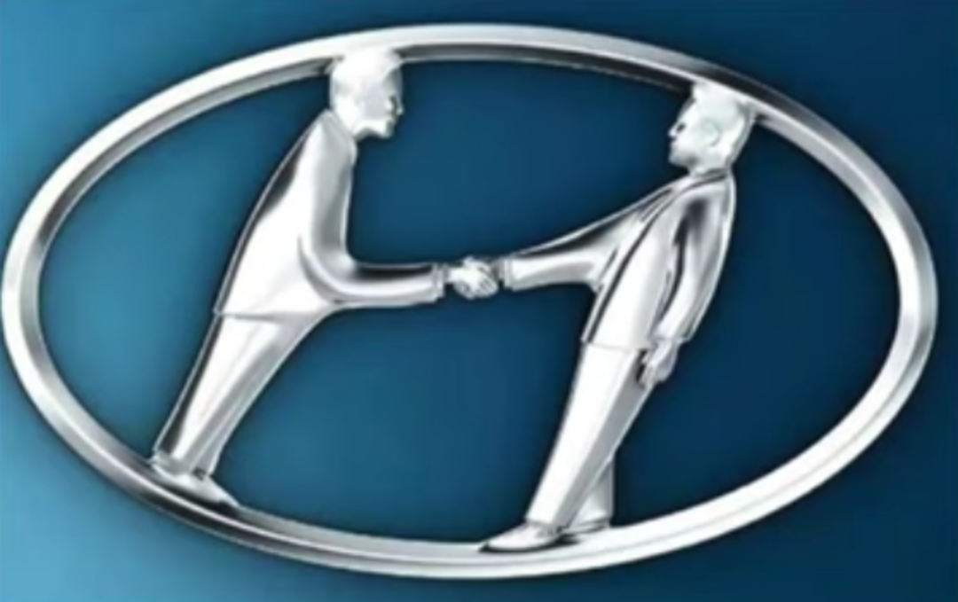
Most people just see the H and think nothing of it, but it actually shows two people shaking hands. One represents the company, and the other is a happy customer. Kind of a nice touch.
7. Beats

The red circle in the Beats logo isn’t just a B. It’s also designed to look like a person wearing headphones, viewed from the side. Super minimal but clever.
8. Pinterest

The P in the Pinterest logo is shaped like a pushpin, which fits perfectly since the whole idea of the platform is to pin things you find interesting or want to save.
Sign up for our newsletter
9. Cisco

The vertical bars in the Cisco logo represent a digital signal, but they also mimic the shape of the Golden Gate Bridge, which ties back to the company’s San Francisco roots.
10. LG

If you look at the LG logo a certain way, you’ll see a human face. The L is the nose, and the G forms the outline of the head. It’s subtle, but intentional.
11. Adidas

Those three diagonal stripes are actually meant to look like a mountain, which is supposed to symbolize the challenges athletes push through. Pretty fitting for a sports brand.
12. NBC

The colorful design in the NBC logo is actually a peacock with six feathers, each one representing a different part of the company. And the peacock is facing right, which is meant to show that they’re forward-thinking.
13. Audi

The four rings in the Audi logo represent the four car companies that merged to form Auto Union, which eventually became Audi. The companies were Audi, DKW, Horch, and Wanderer.
14. Tostitos

This one’s actually kind of fun. The two Ts in the middle of the logo are shaped like people, and they’re both reaching toward a chip, dipping it into a bowl of salsa that’s hidden in the dot of the “i”.
15. Goodwill

Goodwill’s logo is simple but smart. That lowercase “g” also looks like a smiling face. Which is kind of the whole vibe they’re going for. It’s cheerful and friendly.
16. Gillette

If you zoom in on the Gillette logo, you’ll see the G and I have clean, sharp slices taken out of them. It’s meant to mimic the precision of a razor blade, like the logo itself was shaved.
17. Dell

Ever notice how the E in the Dell logo is tilted? That was done on purpose to show that the company likes to think differently and break the mold. It’s a small design tweak that says a lot about how they see themselves.
18. Domino’s

The three dots on the Domino’s logo aren’t random. They represent the original three locations the chain started with. The plan was to add more dots for each new store, but thankfully, they stopped after three.
19. Jack in the Box

It’s hard to spot, but in the old version of their logo, the letters “o” and “x” formed a fish symbol. It was a subtle reference to a fish sandwich they once offered, even though the connection didn’t stick.
20. Wikipedia

The puzzle globe is made of pieces that feature characters from different writing systems. Plus, it’s intentionally left incomplete to represent that knowledge is always growing.
Want to see more surprising content?
Check out Everyday Products with Surprising Hidden Features, or take a look at 15 Terrifyingly Twisted Statues That Should Never Have Been Sculpted. Finally, if you want to see more logo content, check out Remember These? 20 Retro Logos That Look Wild Today.