
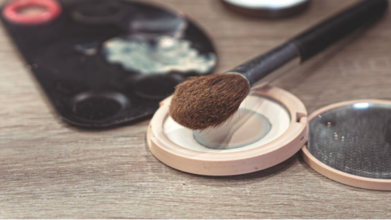
Products changed by customer feedback are a reminder that some of the smallest annoyances can have surprisingly long lives inside a product-development meeting. A date disappears when the box gets tossed. A package corner feels unnecessarily sharp. Sunscreen works perfectly well until someone tries to reapply it over a full face of makeup.
Companies collect those frustrations through complaints, surveys, reviews, testing, and customer-service conversations. Sometimes the response is a tiny packaging tweak. Other times, it becomes the starting point for an entirely new product. These 18 examples and design problems show what can happen when the people making something pay attention to the people actually using it.
1. HON-DASHI Put the Expiration Date on the Inner Bag

Throw away the HON-DASHI box and one rather useful piece of information could disappear with it: the expiration date. Ajinomoto documented customer feedback about exactly that problem and responded by adding the date to the inner bag as well. It is almost absurdly simple, which is precisely what makes the fix so satisfying. The information was already there. It just needed to survive the recycling bin.
2. Sunscreen Became Easier to Reapply Over Makeup
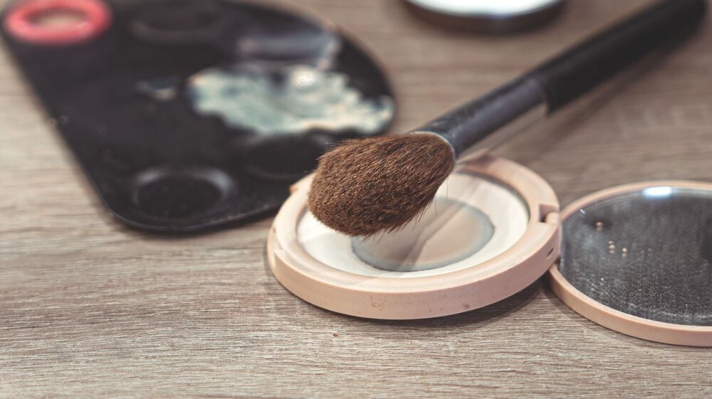
Reapplying sunscreen sounds sensible until makeup enters the equation. Shiseido says concerns about how difficult that could be helped inform its ANESSA Perfect UV Brush-On Powder, introduced in 2025. Rather than modifying an old package, the company developed a product around the problem itself: sunscreen that could be reapplied over makeup without requiring a complete bathroom reset.
3. An Instant-Noodle Lid Became Easier to Peel
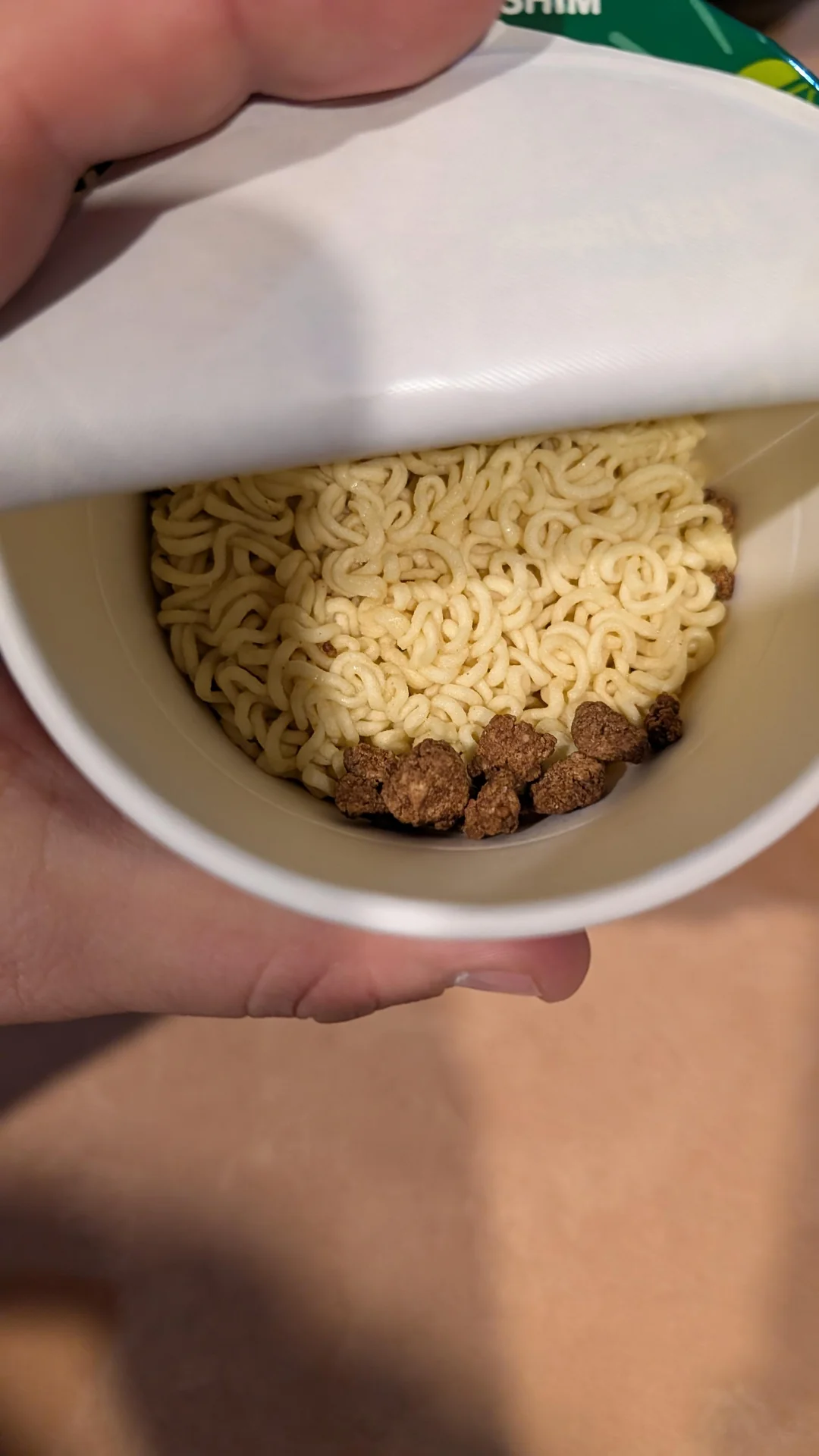
Few things make hunger feel more dramatic than packaging refusing to cooperate. Ajinomoto cited complaints about hard-to-open lids on Yum Yum Cup TemTem and introduced an easier-to-peel version. No radical reinvention was necessary. The noodles could remain noodles. The lid simply needed to stop behaving like the final level of a puzzle game.
4. A Dryer-Bar Holder Needed Better Adhesive
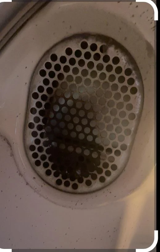
A Bounce Dryer Bar is not especially useful if its holder decides to detach itself. A widely repeated account describes a customer reporting that problem, followed by a change involving longer adhesive tape and clearer instructions. There is a catch, though: the story is commonly cited through secondary sources rather than a definitive original company account, so the exact role of that individual complaint remains uncertain. Still, it illustrates the wonderfully unglamorous world of product improvement: sometimes innovation is just making the sticky part stick better.
5. Seasoning Stick Packs Got Gentler Corners

Can the corner of a seasoning packet really be irritating enough to redesign? Apparently, packaging ergonomics can get that specific. Ajinomoto AGF has reported rounding the corners of stick packaging to make the packs gentler and easier to handle. It is the kind of microscopic improvement most shoppers would never consciously notice, which may actually be the point. Good packaging often works best when nobody has to think about it.
Trending on The Scroller


6. Foundation Was Rethought Around the Feeling of Heavy Makeup

Traditional foundation can sometimes feel like a choice between coverage and comfort. Shiseido describes research into a serum-first approach that responded to concerns about the feel of conventional foundation, eventually producing Essence Skin Glow Foundation. This was broader customer-need-driven development rather than one dramatic complaint changing everything overnight. Still, it shows how “I don’t like how this feels” can become a surprisingly useful design brief.
7. Toy Companies Faced Calls for More Inclusive Characters
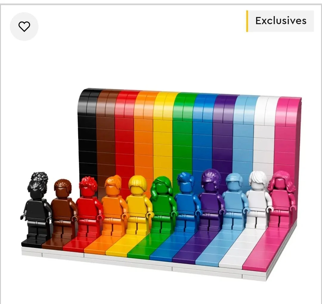
LEGO has increasingly explored broader representation across its characters and sets, but pinning any particular launch on one customer complaint would go further than the available evidence allows. The interesting product-design question is larger anyway: when customers ask to see more kinds of people reflected in a toy universe, how should that feedback appear in the products themselves? Without a specific documented product-and-response trail, this remains a broader example rather than a neat before-and-after story.
8. Spill Reports Can Put Cup and Lid Design Under the Microscope

A coffee lid seems simple right up until it leaks onto somebody’s shirt. Spill complaints are exactly the kind of feedback that could expose weaknesses in a cup or lid design, but a specific manufacturer-backed redesign is needed before declaring a particular coffee cup the hero of this story. And no, the famous hot-coffee lawsuit cannot simply be used as proof that one complaint redesigned the cup. Sometimes the popular version of product history is much tidier than the evidence.
Sign up for our newsletter
9. Shampoo Bottles Are Being Judged by More Than What Is Inside
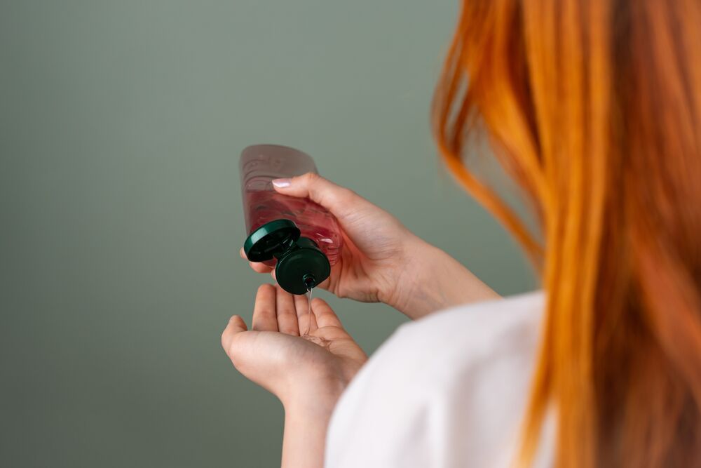
Wet hands plus stubborn packaging is a tiny domestic feud nobody requested. An easier-to-open shampoo bottle would be a natural response to accessibility and usability complaints, particularly for customers with limited dexterity. But without a named beauty brand and a documented before-and-after redesign, this remains a product-design scenario rather than a verified company case. The problem is convincing. The corporate paper trail still needs to catch up.
10. Resealable Snack Bags Address a Very Familiar Complaint
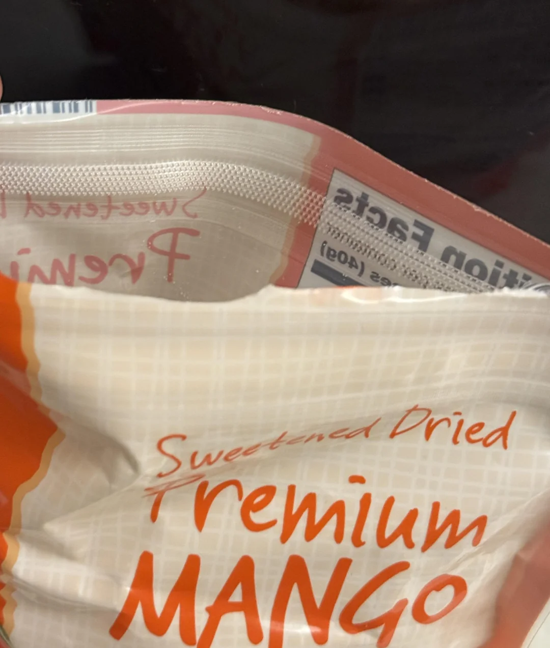
Products changed by customer feedback can sometimes improve through something as small as a zipper. A resealable snack package solves an obvious annoyance: opening a bag should not automatically start a countdown to stale chips.
11. Video Game Interfaces Can Change After Players Push Back

Video games have one enormous advantage over shampoo bottles: designers can change them after customers already own them. When players hate an interface, developers can potentially rework menus, controls, or displays through an update. But online outrage alone does not establish causation. To call a UI redesign customer-driven, there needs to be a specific game version and developer documentation explicitly connecting the change to player feedback. Otherwise, a furious Reddit thread is evidence of fury, not necessarily evidence of product development.
12. Phone Features Can Disappear and Then Come Back

Removing a familiar phone feature can turn a software update into a very efficient way of discovering just how attached people were to it. Companies can restore features after users object, but proving that sequence requires more than noticing that complaints happened before the feature returned. A named manufacturer, specific software version, official release notes, and an explicit acknowledgement of feedback would turn this from a tempting anecdote into a solid example.
13. Even an Appliance Handle Can Become a Design Problem
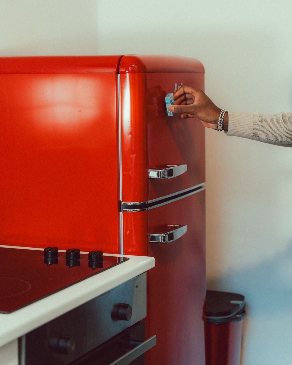
Sometimes the flaw is not inside the appliance at all. It is the part people touch every single day. Product-development research documented by McKinsey describes interviews uncovering opportunities for ergonomic improvements, including the way consumers physically interact with products. What is missing here is a publicly named appliance that can anchor a clean before-and-after story. Until one is documented, the lesson is stronger than the example: watching someone struggle with a handle can reveal more than asking whether they “like” the appliance.
14. Toy Instructions Can Be Harder Than the Toy
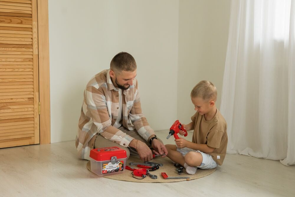
The toy is supposed to be the fun part. The instruction sheet should not become the evening’s main antagonist. Manufacturers can revise assembly directions when customers repeatedly struggle with them, but a solid example needs evidence showing both the problem and the revised instructions. Until then, the scenario remains painfully believable but not tied to a verified product. Anyone who has stared at a mysterious leftover screw will understand the appeal.
15. Subscription Boxes Can Learn From the Box Itself

For subscription products, the box itself is part of the experience. A difficult opening mechanism, damaged contents, or packaging that performs badly in transit can generate feedback before customers even reach the product. A company changelog or customer-response post could document a genuine packaging fix, although there is an important distinction here: improving shipping logistics is not automatically the same thing as improving the product. Sometimes the cardboard deserves its own category.
16. Sometimes the Problem Is the Manual

Perhaps the most humbling product flaw is one that requires no new materials, engineering, or machinery to fix. Sometimes people simply cannot understand the manual. Rewriting confusing instructions after customer feedback would make a wonderfully clean before-and-after case, especially if archived versions showed exactly what changed. Without a manufacturer-documented example, though, it remains an unfinished lead. The good news is that somewhere out there, a diagram labeled “Figure 7B” is probably waiting for its redemption arc.
Customer feedback does not always produce a dramatic redesign. Sometimes it moves an expiration date a few inches, softens a package corner, or asks a company to reconsider how a familiar product feels in everyday use. And that may be the most interesting part: the products sitting quietly in cabinets, bathrooms, kitchens, and pockets are not necessarily finished designs. They are snapshots of countless decisions, some of which began with somebody saying, essentially, ‘This part is annoying.’
Keep Exploring The Scroller
The ordinary objects around us have surprisingly complicated biographies. Keep exploring The Scroller for more stories about products that evolved, everyday designs that quietly changed, and the tiny consumer frustrations that sent designers back to the drawing board:
20 Products That Quietly Lost Features While Getting More Expensive
Shrinkflation: 19 Products That Look The Same Until We Check The Net Weight