We are surrounded by hundreds of corporate logos every day, from the moment we check our phones in the morning to the snacks we grab before bed. Most of the time, we treat these symbols as simple markers of a brand we trust, barely giving them a second thought. However, the world’s top graphic designers are masters of subliminal messaging, often hiding “Easter eggs” and clever symbols within these designs to tell a deeper story about the company’s mission. These hidden elements are designed to speak to our subconscious, creating a sense of cleverness and connection that most consumers never even realize is happening.
Once you discover the hidden layers within these logos, your trip to the grocery store or the mall will never be the same. These designs aren’t just about pretty colors and modern fonts; they are carefully constructed puzzles that often use negative space to hide arrows, animals, and even mathematical secrets. It’s a testament to the power of minimalist art that a few simple lines can contain a world of meaning. Let’s pull back the curtain on twenty of the most famous symbols in the world and reveal the genius secrets hidden in plain sight.
1. FedEx: The hidden arrow
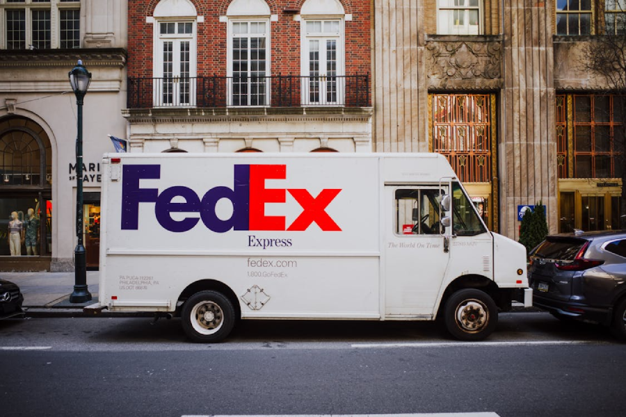
The FedEx logo is perhaps the most famous example of using negative space to create a secondary image. If you look closely between the “E” and the “x,” you will see a perfectly formed white arrow pointing to the right. This subtle detail was designed by Lindon Leader in 1994 to symbolize the company’s speed, precision, and forward-thinking direction. It’s so effective that once you spot it, your eyes will jump to it every time you see a delivery truck passing by.
2. Amazon: More than a smile

Most people see the yellow swoosh under the Amazon logo as a smiling face, indicating happy customers, but it actually carries a much more literal message. The arrow starts at the letter “a” and ends at the “z,” signifying that the company sells everything you could possibly need from A to Z. It’s a clever bit of branding that emphasizes their massive inventory without cluttering the design with words. The “smile” also doubles as a dimple, reinforcing the friendly, approachable nature of the brand.
3. Tostitos: Two friends and a bowl
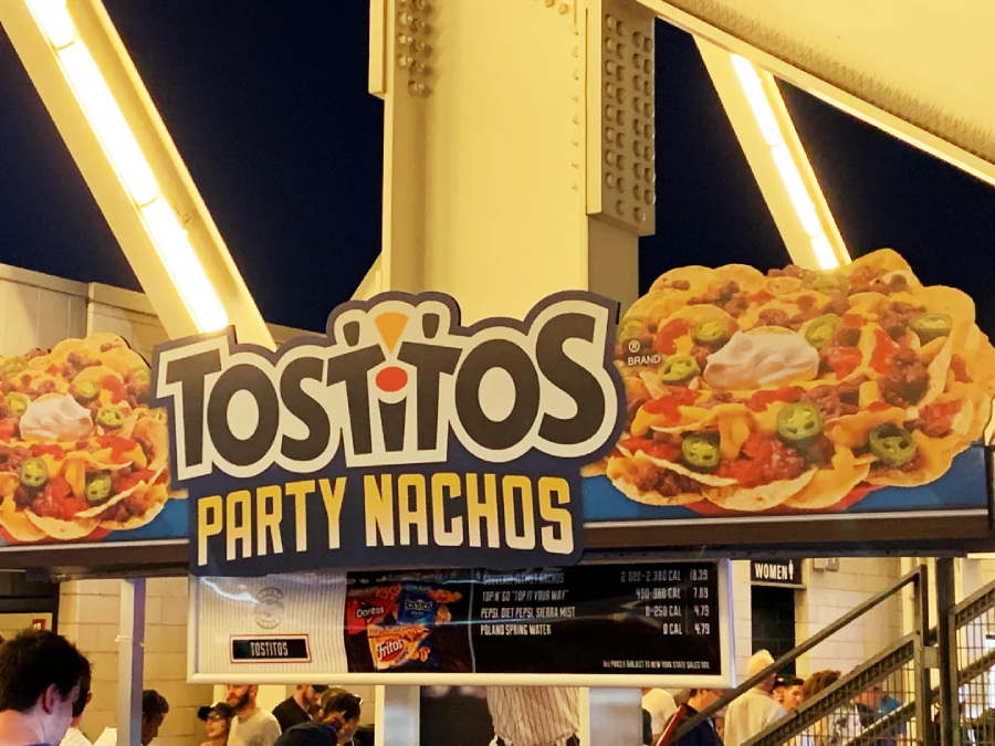
The next time you’re dipping a chip, take a long look at the center of the Tostitos logo. The two lowercase “t”s in the middle are actually designed to look like two people sharing a tortilla chip over a bowl of salsa, which is represented by the red dot over the “i.” This hidden imagery is meant to promote the idea of social connection and sharing that the brand wants to be associated with. It transforms a simple wordmark into a miniature scene of a party in progress.
4. Baskin-Robbins: The magic number
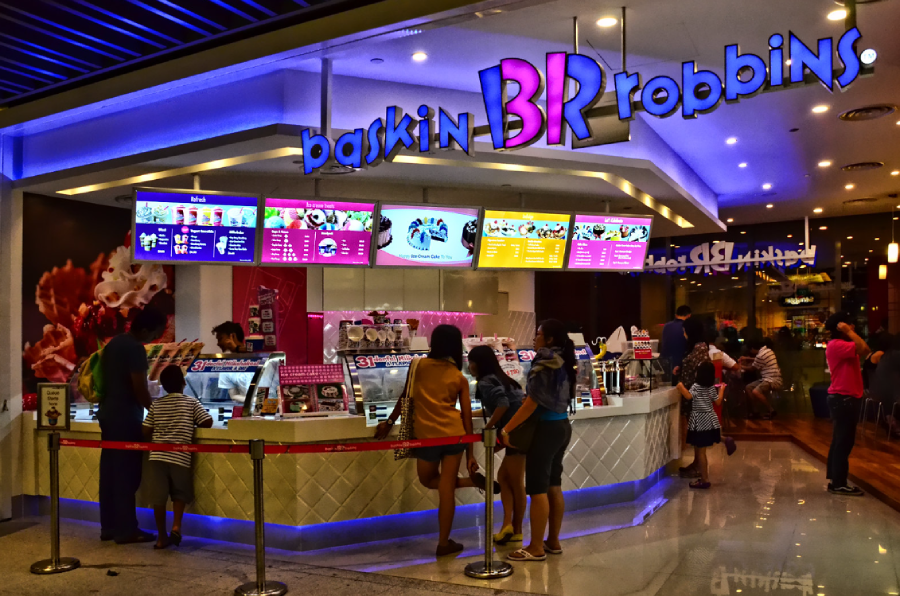
The Baskin-Robbins logo features a playful “B” and “R,” but if you focus only on the pink portions of the letters, the number “31” suddenly appears. This represents the company’s famous “31 flavors” concept, which was based on the idea that a customer could try a new flavor every single day of the month. It’s a brilliant way to integrate their core business philosophy directly into their visual identity. Even though they now have hundreds of flavors, the “31” remains a tribute to their heritage.
5. Toblerone: The hidden bear
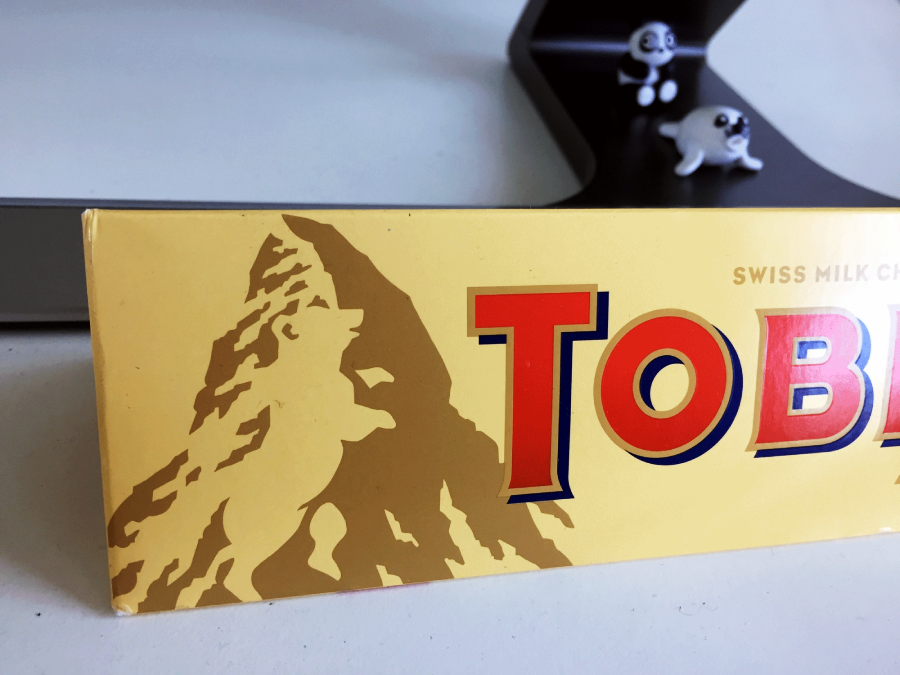
Toblerone originates from Bern, Switzerland, a city famously known as the “City of Bears.” If you look closely at the white space within the mountain on the logo, you can see the silhouette of a bear standing on its hind legs. The mountain itself represents the Matterhorn, the most famous peak in the Swiss Alps, grounding the brand in its geographic roots. It’s a subtle nod to the local culture that adds a layer of mystery to every gold-wrapped chocolate bar.
Trending on The Scroller


6. Pinterest: The hidden pin

The Pinterest logo is more than just a stylized letter “P” inside a red circle. If you look at the base of the letter, you’ll notice it has been sharpened into a literal point to resemble a map pin or a thumbtack. This perfectly matches the platform’s core concept of “pinning” things you love to a digital corkboard. It’s a subtle but effective way to visually define the brand’s function without needing extra icons.
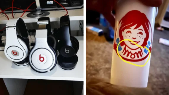
7. Beats by Dre: The person wearing headphones
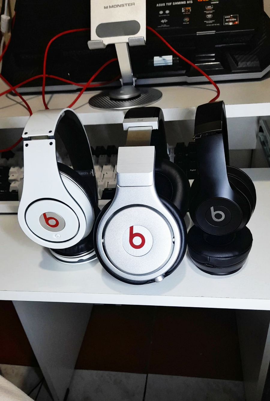
The Beats logo is famously minimalist, consisting of a lowercase “b” inside a red circle. However, if you look at the circle as a human head and the “b” as the profile of a pair of headphones, the symbol suddenly becomes a person listening to music. This clever use of iconography places the consumer directly at the center of the brand. It suggests that the product isn’t just a gadget, but a personal experience for the listener.
8. Tour de France: The hidden cyclist
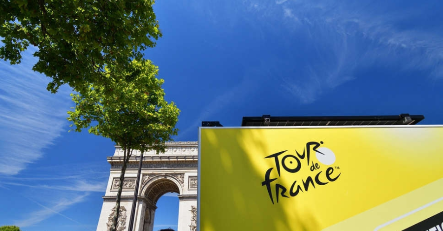
The logo for the world’s most famous cycling race contains a hidden athlete built right into the typography. The yellow circle represents a sun or a bicycle wheel, while the “o,” “u,” and “r” in the word “Tour” are shaped to look like a cyclist leaning forward in a racing position. The yellow color also pays homage to the iconic “Maillot Jaune” or yellow jersey worn by the race leader. It is a masterful example of dynamic design that captures the movement and spirit of the sport.
Sign up for our newsletter
9. Hyundai: The secret handshake
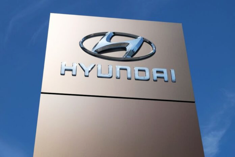
Most people assume the “H” in the Hyundai logo simply stands for the company’s name, but it has a much more human meaning. The slanted “H” is actually a stylized silhouette of two people shaking hands, representing the company and the customer. This symbol is meant to convey trust, satisfaction, and the successful closing of a deal. It transforms a cold industrial letter into a symbol of a positive relationship and corporate integrity.
10. Formula 1: The unseen “1”

Until its redesign in 2018, the classic F1 logo was a favorite among graphic design fans for its use of negative space. While the “F” is black and the “speed marks” are red, the number “1” is actually formed by the empty white space between them. Many people looked at this logo for years without ever seeing the “1” hidden in the middle. It captured the high-speed energy of the sport while hiding the brand’s most important number in plain sight.
11. Wendy’s: The “mom” in the collar
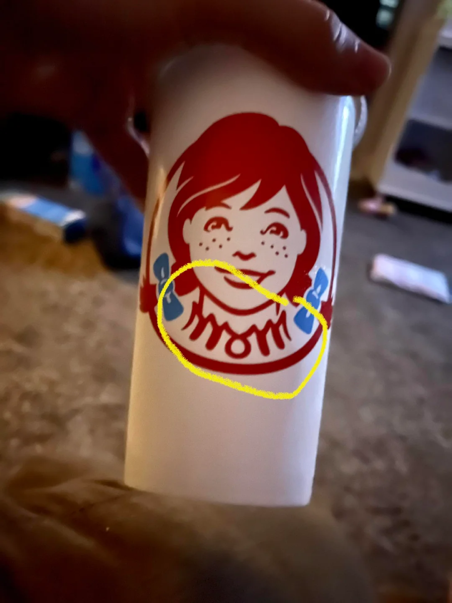
The Wendy’s logo features a wholesome illustration of the founder’s daughter, but if you look closely at her ruffled collar, the word “MOM” appears to be spelled out. Many fans believe this was an intentional way to link the fast-food chain with “mom’s home cooking” and a sense of family comfort. While the company has stated it may be a coincidence of the design, it remains one of the most famous urban legends in the world of branding. It adds a subtle, psychological layer of nostalgia to every burger you buy.
12. Cisco: The Golden Gate Bridge
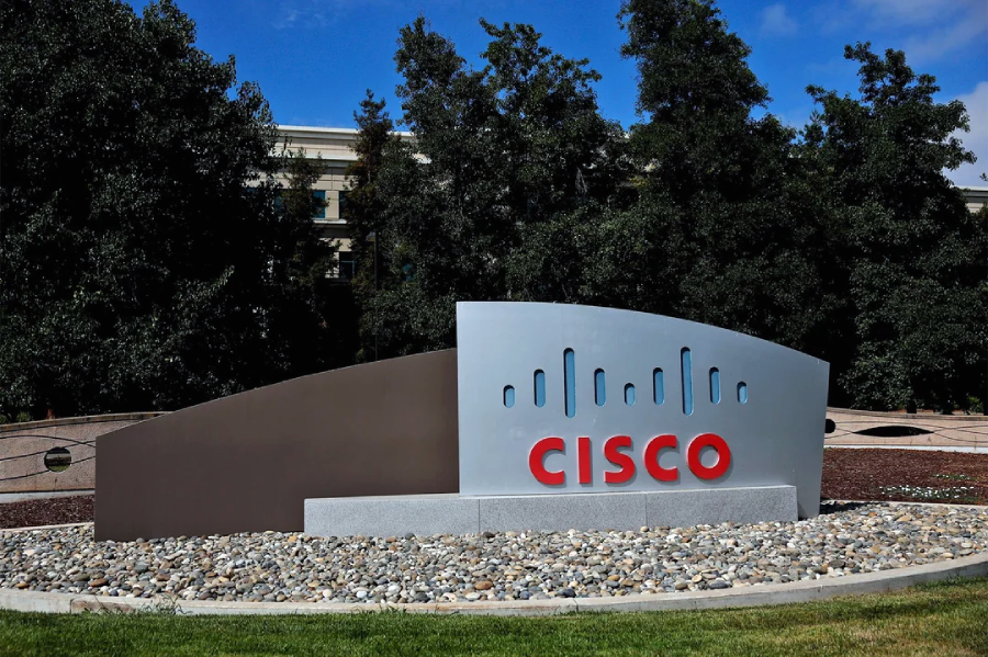
Cisco was founded in San Francisco, and its logo is a clever tribute to the city’s most famous landmark. The blue vertical lines of varying heights represent a digital signal or a bar code, but they are also shaped to mimic the towers of the Golden Gate Bridge. Even the company name itself is actually just the final five letters of “San Francisco.” This design perfectly blends the company’s tech roots with its proud geographical heritage.
13. LG: The Pac-Man face

The LG logo is a clever arrangement of the letters “L” and “G” to form a winking human face, but internet sleuths discovered a fun secondary secret. By shifting the “L” slightly and rotating the image, the logo transforms perfectly into the iconic video game character Pac-Man. While LG hasn’t officially confirmed this as a planned feature, the resemblance is too perfect to ignore. It gives the massive tech conglomerate a playful, approachable personality that stands out in a crowded market.
14. Toyota: The sewing needle

The Toyota logo consists of three overlapping ovals, but they aren’t just random shapes; they actually tell the history of the company. If you look through the center, the inner ovals form a “T,” but they also represent a needle thread passing through an eye. This is a tribute to Toyota’s origins as a manufacturer of industrial weaving looms before they transitioned to cars. It is a brilliant way to honor their industrial past while maintaining a modern, global look.
15. Adidas: The mountain of challenges
The three stripes of the Adidas logo have been a staple of sportswear for decades, but their specific angle carries a heavy meaning. In the “Performance” logo, the stripes are slanted to form the shape of a mountain. This represents the obstacles that athletes must overcome and the goals they strive to achieve. It turns a simple pattern into a motivational symbol for anyone wearing their gear to push through the pain.
16. NBC: The colorful peacock
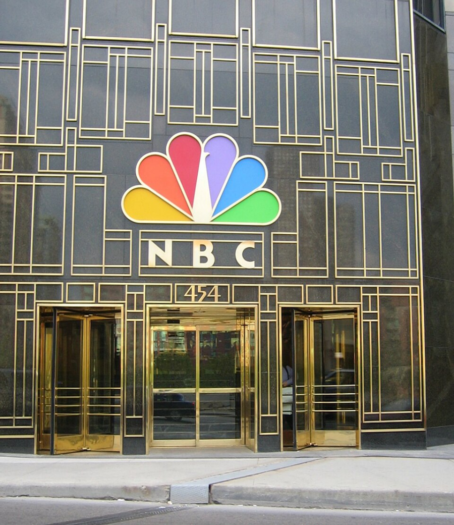
The white space in the center of the NBC logo forms the body of a peacock, with the colored feathers representing the network’s six original divisions. When it was first introduced, the vibrant colors were a way to encourage viewers to switch from black-and-white to color televisions. The peacock is shown looking to the right, which symbolizes the network’s focus on looking toward the future. It remains one of the most colorful and recognizable symbols in American media history.
17. Hershey’s Kisses: The concealed chocolate
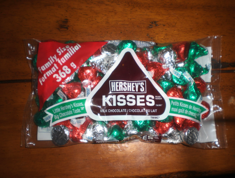
You’ve seen the bag a thousand times, but have you ever looked between the “K” and the “i” in the word “Kisses”? In the negative space, you can find a hidden chocolate “Kiss” tilted on its side, mirroring the actual shape of the candy. It is a tiny, charming detail that rewards observant shoppers and reinforces the product’s unique shape. It is one of those “Easter eggs” that feels like a secret gift from the designers to the fans.
18. Sony VAIO: Analog vs. digital
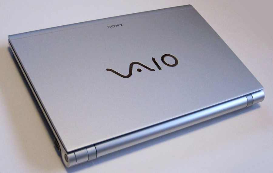
The VAIO logo is a masterpiece of technical symbolism that perfectly describes the evolution of technology. The “V” and “A” are joined together to represent an analog wave, while the “I” and “O” are designed to look like the binary digits 1 and 0. This signifies the transition from the old analog world to the new digital era that Sony’s computers helped lead. It is perhaps the most “engineer-friendly” logo ever created, hiding a lesson in computer science in a stylish font.
19. Unilever: The “everything” U
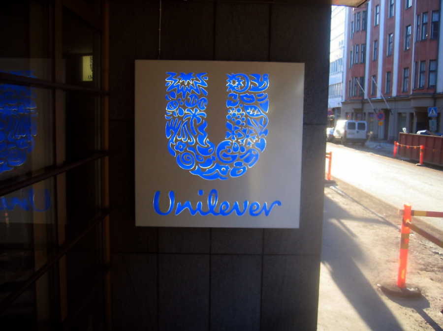
The massive “U” in the Unilever logo is composed of 25 distinct icons, each representing a different aspect of the company’s vast business empire. You can find a lock of hair for their shampoo, a spoon for their food brands, and even a palm tree for their commitment to the environment. It is a visual encyclopedia of a global conglomerate, showing that they have a hand in almost every part of your daily life. It is one of the most complex “simple” logos ever designed.
20. Northwest Airlines: The compass
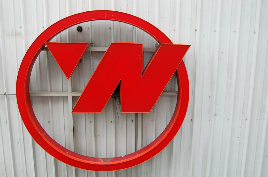
Before it merged with Delta, Northwest Airlines had a genius logo that featured a “W” with a small triangle in a circle. Not only did the triangle and the “N” form a “W” together, but the circle acted as a compass, with the triangle pointing exactly toward the North-West. It was a perfect piece of minimalist branding that incorporated the company name, its initials, and its primary function into one small symbol. It remains a legendary example in design textbooks for its efficiency and cleverness.
Want more fun facts?
It’s amazing how much thought and strategy goes into a symbol that we usually glance at for only half a second. These logos prove that branding is an art form that operates on multiple levels, rewarding those who take the time to really look at the world around them. If you’re in the mood to uncover more design peculiarities, don’t miss these 25 Jaw-Dropping Design Fails You Won’t Believe Passed Review, or these 20 Interior Design Choices That Feel Completely Wrong. You can also check these 21 Haunting Designs That Tried Too Hard To Be Creative.