A company’s logo is often one of the first things people recognize, but even the most familiar designs rarely stay the same forever. As trends change and businesses evolve, logos are updated to feel more modern, appeal to new audiences, or reflect how a brand is changing. Looking back at older versions can be surprisingly revealing, offering a snapshot of the era where they were created.
Some are charming reminders of a different time, while others feel unrecognizable from the originals. Together, they highlight the subtle ways branding evolves and how something as simple as a logo can tell a much larger story about a changing culture.
1. Pepsi

Pepsi’s logo has undergone several transformations over the years. Originally featuring a bottle cap design in the 1950s, the brand shifted to the iconic “Pepsi Globe” in 1973. In 2008, the logo was modernized with a lowercase typeface and an off-center globe. Then, in 2023, Pepsi brought back a more symmetrical globe design, echoing the 1973 version.
2. Gatorade
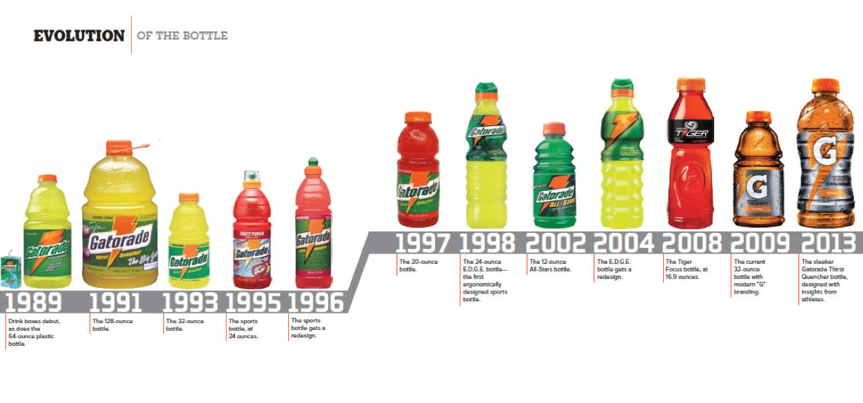
Gatorade’s original logo featured a bold, collegiate-style font. Over time, it adopted a sleeker, more modern design, reflecting its evolution from a sports drink to a global brand.
3. Nike

Nike’s “Swoosh,” created in 1971, has become one of the most recognizable logos globally. Initially accompanied by the “Nike” name, the logo now often stands alone, symbolizing motion and athleticism.
4. Apple

Apple’s logo has transformed from a detailed illustration of Isaac Newton under an apple tree to the sleek, monochromatic apple with a bite taken out.
5. Pizza Hut

The original logo had a little man dressed in yellow. Over the years, it evolved into a simplified hut icon and bold font, capturing fast-casual vibes.
Trending on The Scroller


6. Lego

Lego’s first logo, created in 1934, displayed the brand name in a bold black font, accented with white stripes inside the letters. The logo we recognize today was introduced in 1973, featuring a vibrant red square and rounded white lettering that captures the playful and imaginative spirit of the brand.
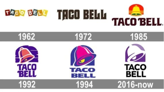
7. Taco Bell

The Taco Bell logo has been recreated many times. It started as a multi-color font with a little sombrero man as the mascot, and has transformed into the purple bell we see today.
8. Gap

In 2010, Gap unveiled a new logo with a blue gradient square, but it was met with strong public backlash. Within a week, the company reverted to a variation of its original design, underscoring the difficulties that come with rebranding well-known logos.
Sign up for our newsletter
9. Reebok

Reebok’s earlier logo was widely recognized, but its newer design has been viewed as more generic and corporate in appearance. As a result, many online shoppers have shown a preference for the original emblem.
10. Firefox

Initially launched under the name Phoenix, Firefox’s first logo depicted a fiery red phoenix with blazing wings. Following a trademark conflict, the browser was renamed Mozilla Firefox and introduced a new logo, featuring a fox with a flaming tail encircling a blue globe.
11. Amazon

In 2000, Amazon introduced its famous logo with a smile-shaped arrow going from “A” to “Z,” showing it sells everything from A to Z. The smile also represents happy customers. Since then, the logo has stayed mostly the same and has become a symbol of Amazon’s success in online shopping.
12. Instagram

Instagram started with a detailed, retro camera icon that screamed early smartphone era. In 2016, it shifted to a minimalist, gradient icon, reflecting the app’s modern, creative-focused branding.
13. Microsoft

Microsoft’s original logo in 1975 had a funky disco-era vibe with a groovy font. Over time, it’s evolved into the clean, flat four-color window introduced in 2012, signaling a unified brand across platforms.
14. AT&T

The original Bell System logo was a literal bell inside a circle. Today’s globe logo, introduced in 1983 and modernized in 2005, conveys connectivity and global reach.
15. Starbucks

The original 1971 logo featured a mermaid in brown. It was cleaned up and turned green in the ‘80s, and by 2011, the wording was dropped entirely. The siren now says it all.
16. YouTube

The original “You” in black and “Tube” in a red TV box screamed early Web 2.0. It’s since shifted to a flat play-button icon with bold type, perfect for today’s mobile screens.
17. Visa
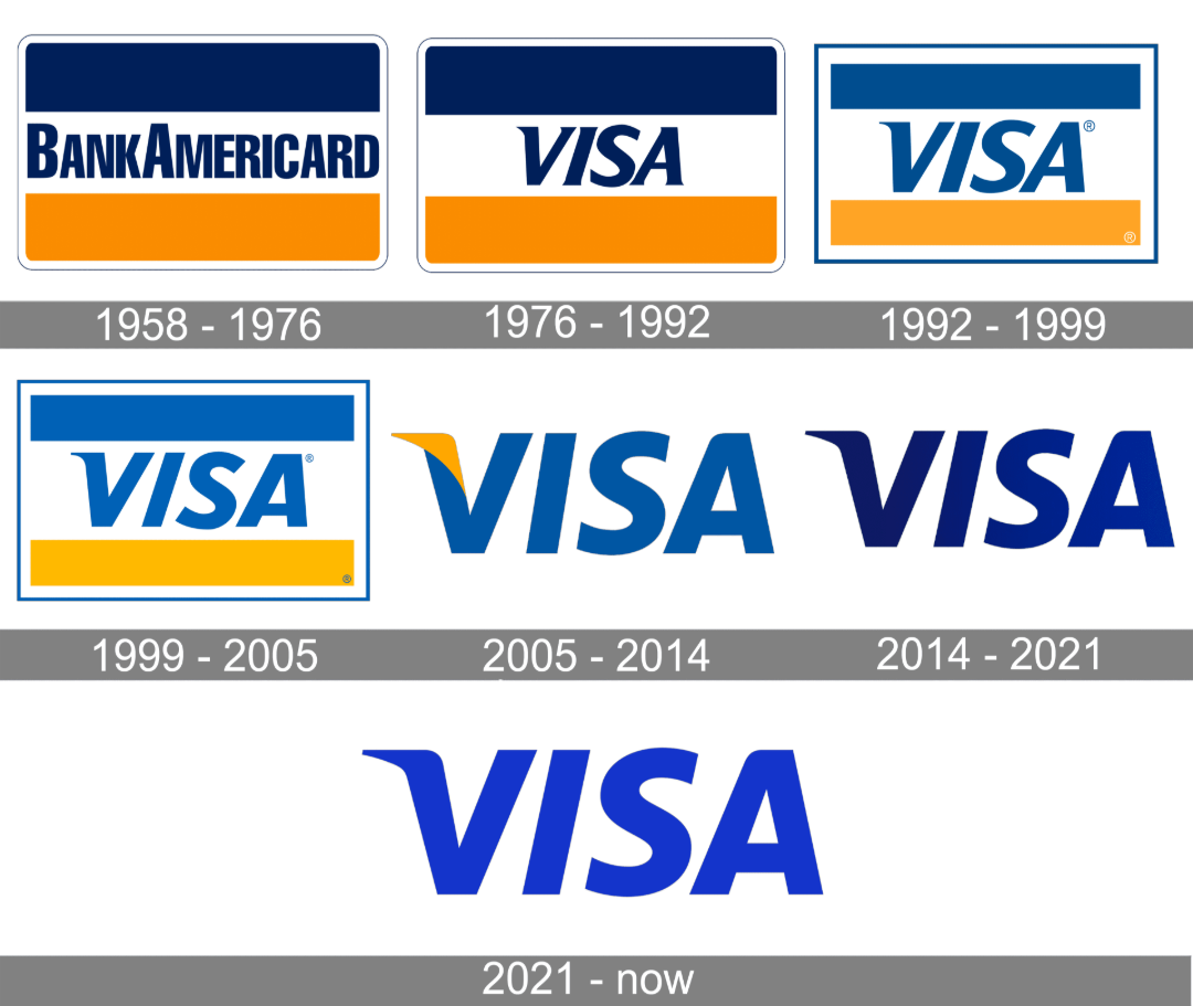
Visa’s older logos and “BankAmericard” logo prominently featured its classic blue and gold bar, symbolizing the sky and mountains of California. Modern versions dropped the bar for a cleaner, text-only design.
18. PlayStation

Sony’s original 1994 PlayStation logo was a colorful 3D-looking “P” and “S”. While it’s stayed recognizable, newer iterations go flatter and cleaner, aligned with current design trends.
19. Walmart

Walmart used a bold logo until 2008, when it introduced a friendlier, lowercase wordmark and spark symbol, signaling a more approachable, service-oriented identity.
Want to see more vintage content?
Check out 25 Vintage Photos of People’s Cars and Bikes in the 1950s, or take a look at 20 Vintage Images from the Infamous Woodstock ’94. Finally, if you want to see colorized photos of soldiers from the past, check out 20 Vintage Colorized Photos of Soldiers in the 1910s.