Some rebranding fails happen because companies refuse to evolve. Others happen because they change the very thing customers loved in the first place. Over the years, countless brands have introduced new names, logos, products, packaging, or identities in hopes of staying relevant, only to discover that winning over new customers sometimes means losing the old ones. From controversial redesigns to complete image makeovers, these famous rebranding fails prove that changing a brand can be far riskier than leaving it alone.
1. New Coke
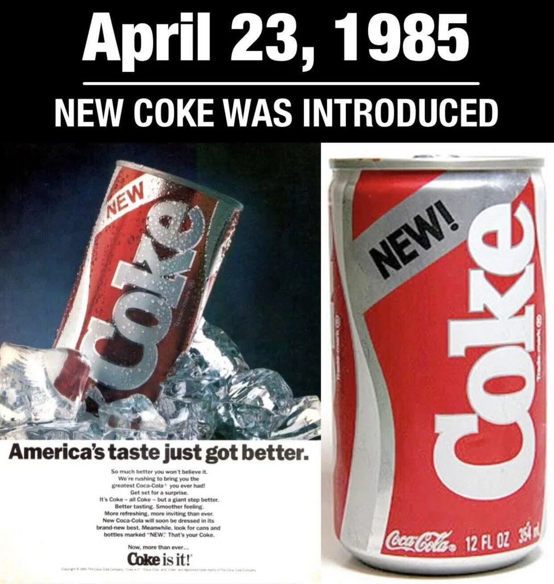
For nearly a century, Coca-Cola had convinced people its original formula was untouchable. Then, almost overnight, it decided to replace it. Customers didn’t just dislike New Coke; they missed the drink they already loved. The backlash became so overwhelming that Coca-Cola brought the original recipe back only 79 days later.
2. Gap’s New Logo

Sometimes a redesign lasts for years. Gap’s famous 2010 logo survived barely a week. After replacing its iconic blue box with a minimalist design, the company was flooded with criticism from customers who wondered why such a recognizable symbol had disappeared. The old logo quickly returned.
3. JCPenney
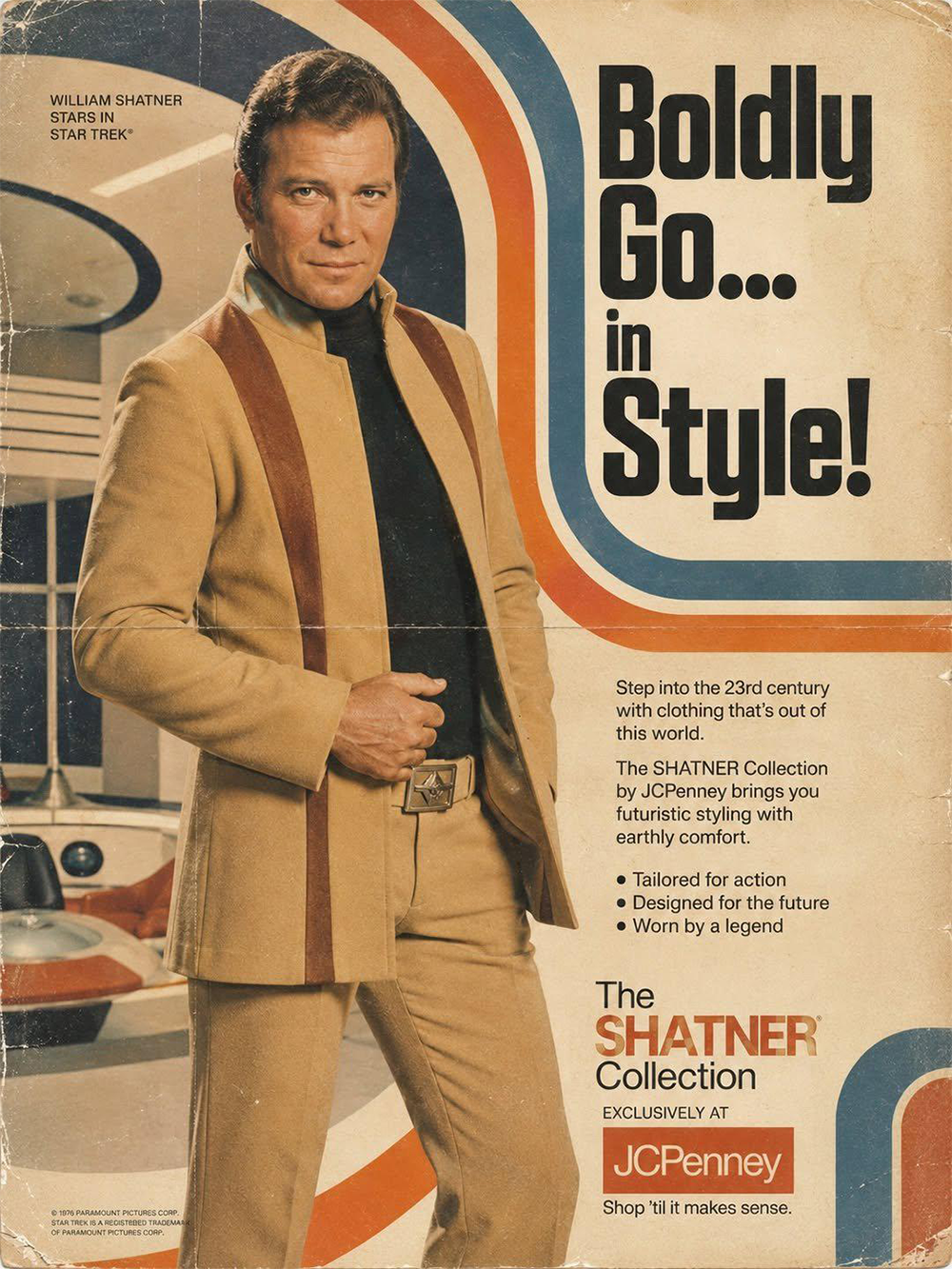
Customers constantly claimed they hated coupons and endless sales. JCPenney decided to believe them. The retailer replaced discounts with simple everyday pricing, expecting shoppers to appreciate the honesty. Instead, many stopped coming altogether because hunting for bargains had become part of the shopping experience.
4. BlackBerry

Can a comeback arrive too late? BlackBerry certainly tried. The company launched new smartphones, adopted the BlackBerry name across the business, and introduced an entirely new operating system. Unfortunately, by then the smartphone market had already shifted, and customers had largely moved on to iPhone and Android devices.
5. Tropicana’s Packaging
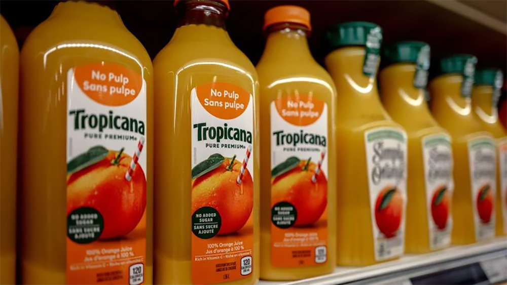
Imagine walking into a grocery store and suddenly not recognizing your favorite orange juice. That’s exactly what happened when Tropicana replaced its familiar orange-with-a-straw packaging with a sleek minimalist carton. Sales dropped almost immediately, proving that packaging isn’t just decoration. Sometimes it’s how customers find you.
Trending on The Scroller
6. RadioShack
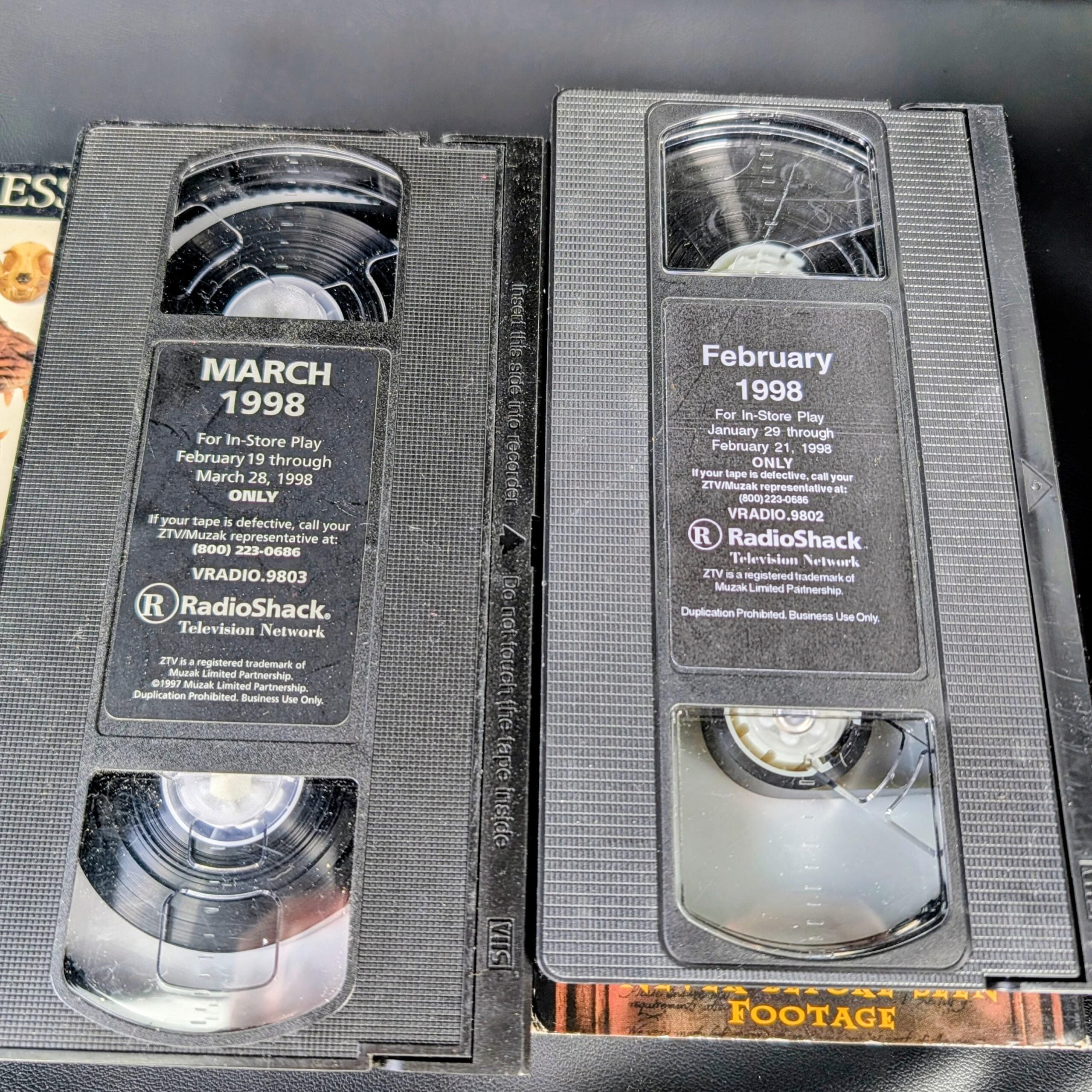
For decades, RadioShack was where people went for electronics parts, cables, and gadgets. Hoping to attract a younger crowd, the company even rebranded many stores as “The Shack” in 2009. The new nickname generated attention, but it couldn’t solve the bigger problem: shoppers had already found easier places to buy electronics.
7. Yahoo
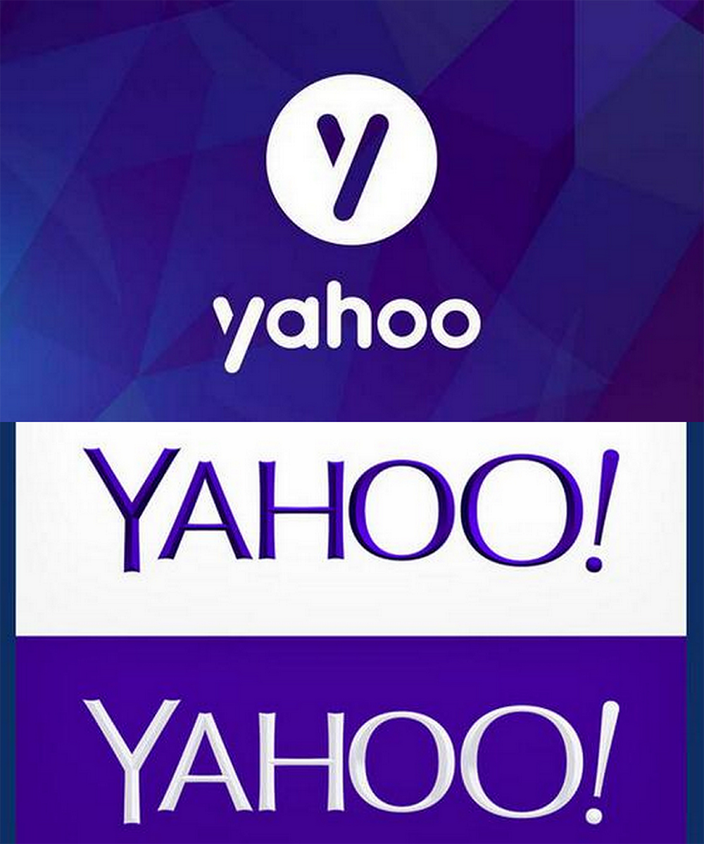
Back in the early days of the internet, Yahoo was one of the biggest names online. Then came a new logo, a fresh CEO, redesigned products, and an ambitious attempt to reinvent the company’s image. None of it was enough to restore its former dominance. Can a brand truly reinvent itself if the market has already moved somewhere else?
8. Sears
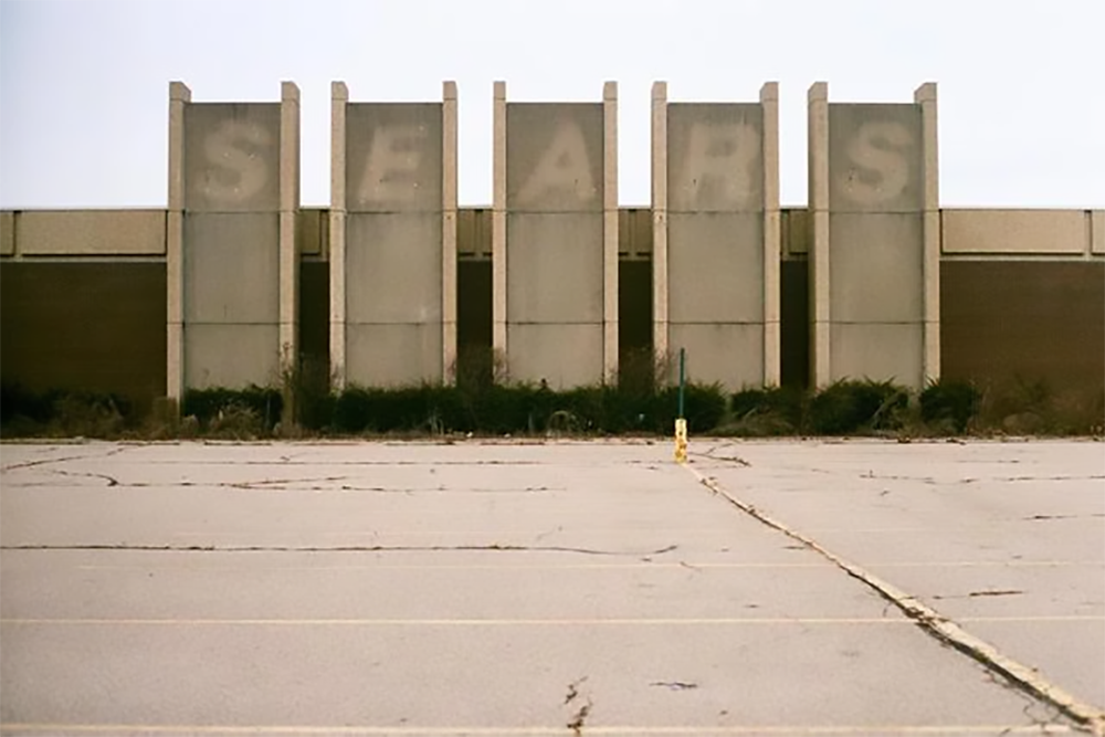
Few retailers seemed as permanent as Sears. As shopping habits changed, the company tried remodeling stores, refreshing its branding, and expanding new concepts to stay relevant. Unfortunately, those efforts couldn’t reverse years of declining sales, growing competition, and changing consumer behavior. Sometimes reinvention arrives after the biggest opportunities have already disappeared.
Sign up for our newsletter
9. MySpace
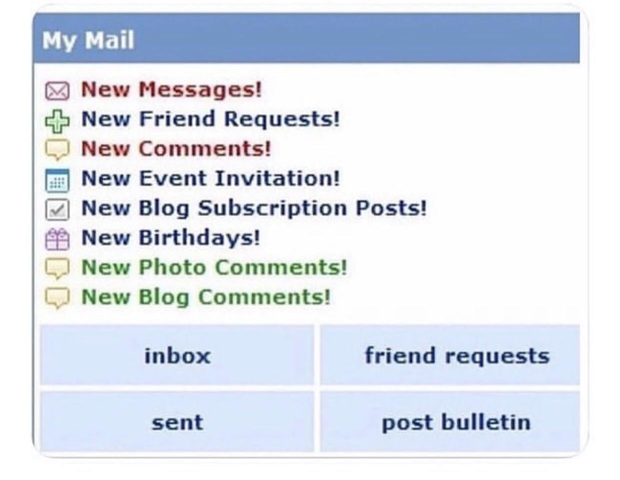
Once the biggest social network in the world, MySpace tried several dramatic reinventions after Facebook overtook it. One of its boldest moves transformed the platform into a destination for music, artists, and entertainment. While the idea attracted attention, it never came close to restoring the massive audience MySpace had once enjoyed.
10. Pizza Hut

Pizza Hut wasn’t trying to become a different company, but it did try to modernize how customers saw it. Updated logos, redesigned restaurants, digital ordering, and new menu strategies all aimed to refresh the brand for a changing market. Even so, competition from newer pizza chains and delivery-first rivals proved much harder to overcome than a simple image makeover.
11. Weight Watchers Becomes WW

Dropping two familiar words seemed like a simple way to modernize the brand. Weight Watchers became “WW” to emphasize overall wellness instead of just losing weight. The problem? Many people weren’t sure what “WW” actually stood for anymore. A shorter name doesn’t always make a clearer brand.
12. Oldsmobile’s “Not Your Father’s Oldsmobile” Campaign
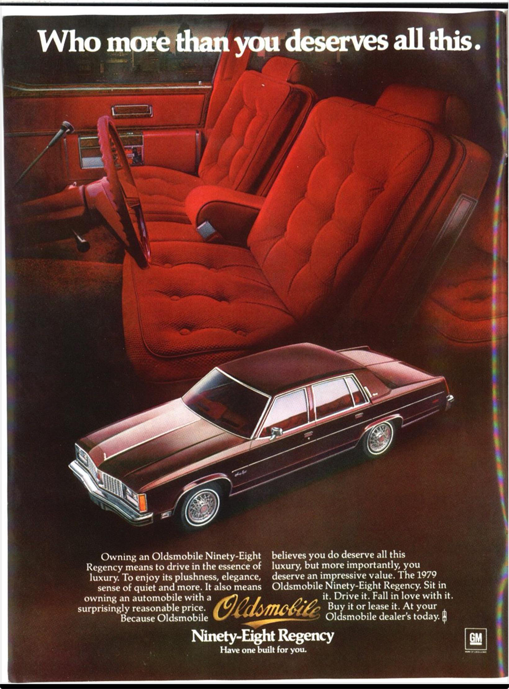
What happens when your biggest marketing campaign accidentally reminds everyone that your customers are… their parents? Oldsmobile hoped to reinvent itself with the slogan “This is not your father’s Oldsmobile,” but many buyers simply heard the part about their father’s car. Instead of attracting younger drivers, the campaign became one more symbol of a brand struggling to escape its own reputation.
13. Victoria’s Secret Becomes “VS Collective”
For decades, Victoria’s Secret was built around a very specific identity. Then came VS Collective, a rebrand designed to replace the famous Angels with a broader, more inclusive image. The shift reflected changing cultural values, but many longtime shoppers felt the brand had abandoned what originally made it recognizable. Can a company evolve without losing the identity people came for?
14. Kodak
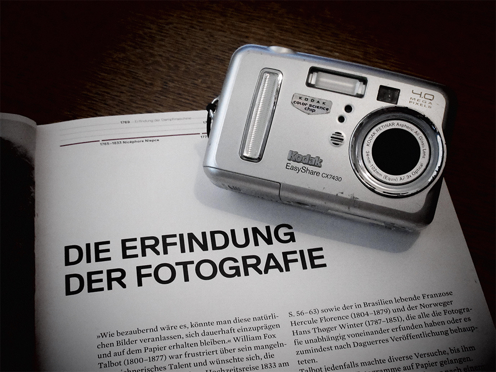
Kodak knew digital photography was coming. In fact, its own engineers helped develop some of the earliest digital camera technology. Even so, the company struggled to reinvent itself fast enough as film sales declined. Ironically, having the right technology wasn’t the same as building the right business around it.
15. Royal Mail Becomes Consignia
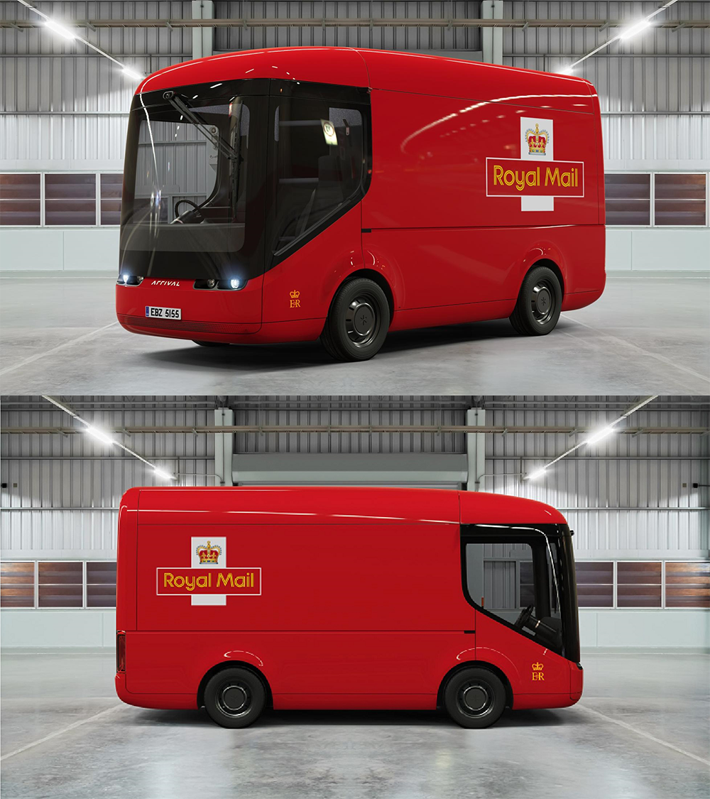
Consignia sounded modern, corporate, and internationally ambitious. There was just one problem: almost nobody liked the new name. Customers continued calling it Royal Mail anyway, and the expensive rebrand quickly became a punchline. Less than two years later, the company quietly returned to the name everyone had been using all along.
16. Saturn Slowly Lost What Made It Different
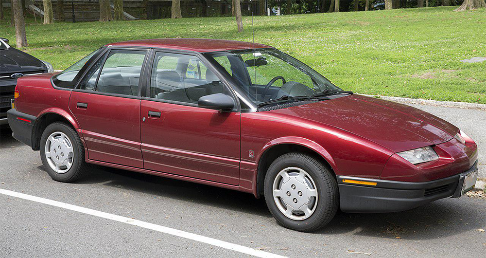
Saturn didn’t disappear because people suddenly hated the cars. It slowly stopped feeling like Saturn. The company had built a loyal following through friendly dealerships, no-haggle pricing, and a distinct personality, but as General Motors blended it more closely with its other brands, much of that identity faded until there was little left to set it apart.
17. Uber’s 2016 Logo Redesign

Sometimes the biggest question after a rebrand is surprisingly simple: what is it supposed to be? Uber replaced its familiar “U” with an abstract symbol that confused users and designers alike. The company spent months explaining the new identity before eventually abandoning it just a few years later in favor of a much cleaner logo.
18. British Airways’ World Images Tailfins
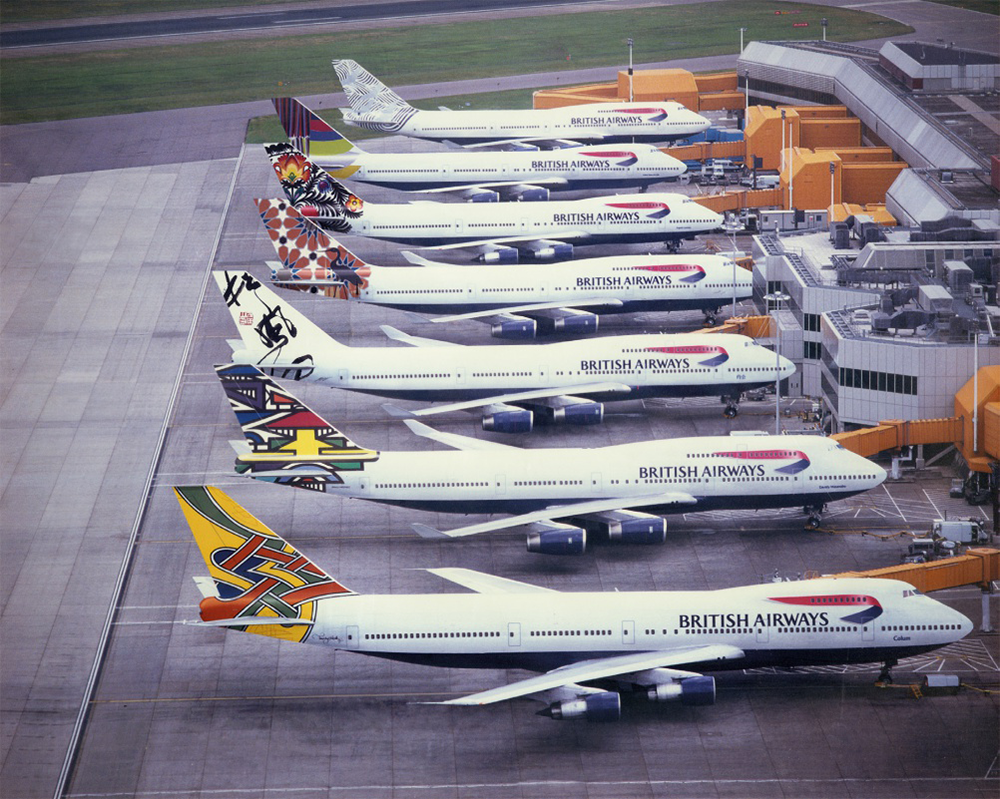
Instead of displaying the Union Jack, British Airways covered its aircraft tails with dozens of designs inspired by cultures around the world. The idea celebrated global travel, but many people felt Britain’s national airline had erased one of its strongest symbols. Even then Prime Minister Margaret Thatcher publicly criticized the change, and the airline eventually restored the traditional tail design.
19. Polaroid Struggled to Reinvent Itself for the Digital Age
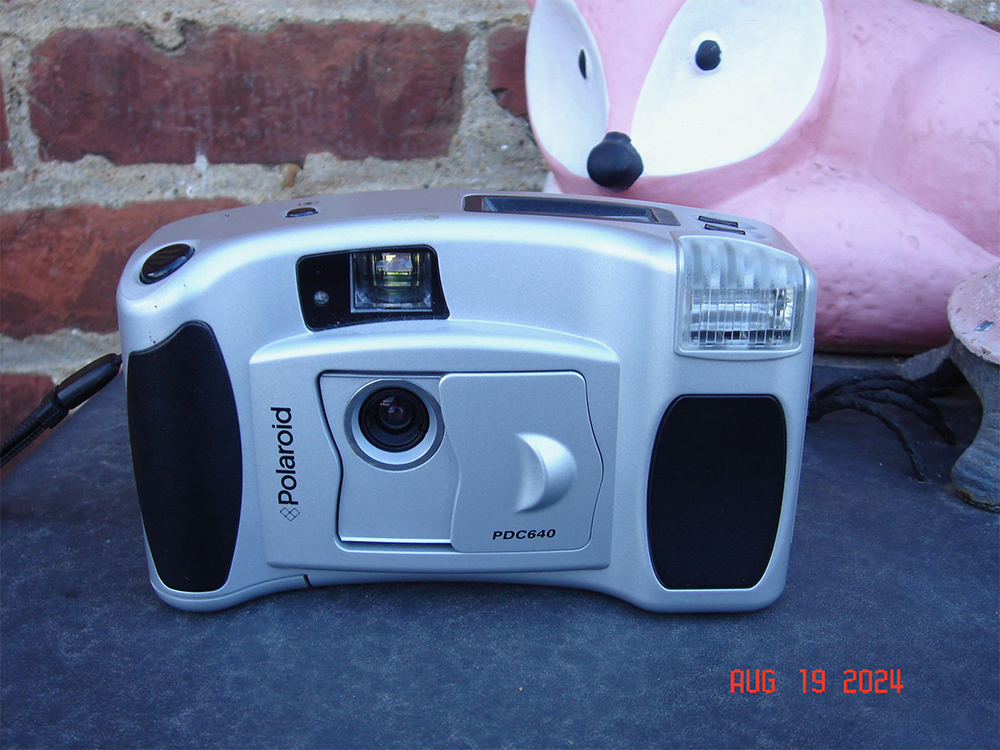
The instant camera had become one of the most recognizable products in photography, but the digital revolution forced Polaroid to rethink everything. New digital cameras and shifting branding tried to reposition the company for a different era, yet consumers no longer associated Polaroid with the innovation it once represented. Reinvention proved much harder than simply introducing new products.
20. Xerox
There was a time when “to Xerox” became synonymous with making a copy. Hoping to become known for far more than copiers, the company invested heavily in business services, software, and consulting while modernizing its brand. The effort expanded Xerox’s business, but many consumers continued to associate the name with photocopiers first. Some brand identities become so powerful that even successful reinvention can’t completely replace them.
The biggest rebranding fails rarely happened because companies stopped innovating. More often, they happened because businesses underestimated how strongly customers connected with familiar products, logos, names, or experiences. Reinvention can be essential for survival, but these stories show that changing a brand is much easier than changing what people already believe about it.
Keep Exploring The Scroller
If you enjoy stories about famous brands, surprising business decisions, and products that didn’t go according to plan, keep exploring The Scroller for more fascinating marketing failures, forgotten companies, iconic products, and the unexpected moments that changed business history forever:
15 Brands That Started As Something Completely Different Before Finding Their Product