
Some companies are doubted because the business looks messy. Others get laughed at because the idea sounds a little dumb when you say it out loud. Tech has always produced both kinds, and gaming people know the pattern better than most, the thing everyone treats like a toy until it starts eating up serious money. A lot of these companies were not ignored at first. They were noticed, then shrugged at, then underestimated for way too long.
Nvidia
r/pcmasterrace
For years, Nvidia got flattened into one simple label, the graphics card company. Depending on who said it, that could sound neutral or quietly dismissive, like the business basically lived and died with PC gamers and people obsessing over settings menus. But if you were around games long enough, you could see the bigger story forming. The company was getting absurdly good at the kind of computing problems that looked niche right up until the rest of the market woke up and realized they were not niche at all.
Netflix
r/animation
A DVD-by-mail service did not sound like the future of entertainment. It sounded like a decent workaround. Convenient, maybe, but still small, still a little temporary. That is part of why the Blockbuster story stuck so hard, because it captured the mood around Netflix before streaming took over. People were not exactly terrified of it. They just did not think it was the thing that would end up changing how a huge part of the world watched TV and movies.
Amazon
r/onepiecetcg
The early Amazon pitch had a built-in problem. An online bookstore is one of those labels that makes people think they already understand the limits of the business. Books sounded narrow. The internet still sounded half-experimental. So a lot of people looked at Amazon and saw a clever little retail idea. What they missed was that books were just the least threatening way into something much larger. The real business was quietly becoming logistics, infrastructure, and habit.
Airbnb
r/dnd
Airbnb sounded sketchy before it sounded smart. That was the gap it had to cross. Sleeping in a stranger’s home did not immediately feel like travel innovation; it felt like the sort of thing you do when the good options are gone. A lot of the early reaction had that tone, interesting idea, maybe, but are normal people really going to do this? Turns out yes, especially if hotels are expensive, cities are crowded, and the app makes the whole thing feel just safe enough to try once.
Shopify

r/shopify
This one started in a way that almost invites people to underestimate it. A group trying to sell snowboards online gets annoyed with the tools, so they build better ones for themselves. That does not sound like the start of a giant company. It sounds like a fix. But internet businesses often come out of that exact kind of irritation, founders hitting the same wall over and over and deciding the software should not be this painful. Shopify kept removing friction for merchants, and that goes a long way.
Trending on The Scroller


Tesla
Logo.wine
There was a stretch where Tesla got discussed like it was half car company, half expensive dare. Electric cars had been framed for so long as worthy and compromised that the idea of building cultural heat around them felt unlikely. Then Tesla made them feel fast, flashy, and a little provocative, which mattered more than many critics wanted to admit. It changed the mood around EVs before the rest of the industry had fully decided how seriously to take them.
Apple
r/apple
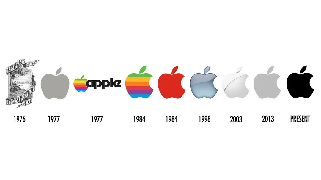
Early Apple came out of hobbyist computer culture, not the kind of environment that usually gets treated as the center of serious business. That mattered. A lot of people with power assumed computers would remain mostly for offices, universities, and technical work. Home computing looked secondary. Apple kept leaning the other way, toward machines that regular people might actually want to use, not just tolerate. In hindsight, that sounds obvious. It was not obvious then.
Facebook, now Meta
r/logodesign
At first, it had the vibe of a campus thing that would probably peak fast. One more social site, one more internet habit, one more place people would eventually outgrow. That assumption made sense for a little while. Then Facebook stopped feeling like a website and started feeling more like a layer sitting on top of everyday online life. Identity, attention, messaging, social proof, it all started piling up there. By then, the old “college site” read looked thin.
Sign up for our newsletter
Uber

Wikimedia Commons
Early Uber sounded useful, but kind of narrow. An app to get a car faster, fine. Nice product. Hardly the basis for a giant. But that was looking at the service too neatly. What Uber was really doing, and often very aggressively, was pushing people to rethink convenience in real time. Not just transport, either. Delivery, labor, expectations, the idea that a service should appear on your phone right now, not later. That shift was bigger than the first pitch made it sound.
Spotify
Wikimedia Commons
Spotify arrived when the music business still felt bruised and suspicious of almost everything digital. So the skepticism around it was not just about the app. It was also about whether streaming itself was a real long-term model or just the next unstable phase after piracy and downloads. A lot of people assumed users would not settle into paying for access. They did. Not in some perfectly clean way, and not without endless arguments about payouts, but they did.
AMD

r/AMD
AMD spent a long time being talked about as a company people remembered more than feared. If you followed PC gaming during those years, you could hear it in the tone. It was often the budget pick, the sentimental pick, the one attached to caveats. Then the products got better, the lineup sharpened, and suddenly that old condescension started looking lazy. It did not happen in one dramatic moment either, which maybe made the turnaround more satisfying.
Roblox
Roblox
A lot of outsiders took one look at Roblox and stopped there. The blocky visuals, the younger audience, the general messiness of user-created worlds, all of that made it easy to dismiss. But the surface was misleading. What kept people there was not the polish. It was freedom. Build stuff, break stuff, hang out, make your own game inside the larger thing. People who were not paying attention saw a kids’ platform. People paying attention saw a system.
Discord
Gameindustry.biz
Discord got stuck with the gamer chat label early, and to be fair, that is where plenty of people first met it. But labels like that age badly when the product is actually more flexible than the stereotype. Pretty soon, it was not just for raid calls or ranked queues. It was for fandoms, group projects, private communities, indie teams, friend circles, weird little corners with their own language and rules. The “just gamers” line held on longer than it deserved to.
Salesforce
Wikimedia Commons
Selling enterprise software over the internet used to sound flimsy to a lot of buyers. Not impossible, exactly, just less trustworthy than the old on-prem setup everyone knew. So Salesforce had to grow inside a market that still had some real suspicion toward the model itself. That is easy to forget now because cloud software feels completely normal. But normal is exactly what it had to become, and that was the hard part.
Coinbase
r/theraceto10million
Crypto drew both deserved skepticism and lazy mockery, and Coinbase got plenty of both thrown at it. A lot of people saw it as a temporary toll booth for a weird speculative wave that would either crash or move on without it. Maybe that was always too simple. During a chaotic stretch for the whole sector, being a somewhat cleaner front door mattered. You do not need the entire industry to look stable for that to have value.
Activision Blizzard
r/gamingnews
Video games spent years getting treated by parts of the business world like they were either a fad or a side category for kids and shut-ins. So companies built around games did not always get the benefit of the doubt, especially when the audience started getting huge faster than outsiders could process. Activision, and later Blizzard too, lived through that old cultural lag. People who actually played knew the money and attention were real long before certain executives did.
Some of these companies looked silly at the start. Some looked small. Some just looked too online, too niche, too dependent on people that mainstream investors did not fully understand yet. That is usually where the read goes wrong. Not because the critics are always clueless, but because early versions of big companies often look a lot less impressive than the finished story people tell later.
In the mood for more?
You can check out 16 Iconic American Companies That Were Started With Less Than $1,000, 20 Hidden Messages In Companies’ Logos Most People Often Overlook, or 14 Product Slogans People Still Recognize Decades Later.